
 I try not to be a bandwagon fan. My music collection features people the majority of you have never heard of (currently obsessed with Diane Birch). But at the same time, I’m not a music snob who sticks her nose up at something just because it’s popular. I even have Taylor Swift’s 1989 album in my rotation to prove it.
I am, however, a web marketing snob. And although I love, love, love Adele and her insanely popular new album 25, I have to say, in general, her web marketing sucks. Not that it matters much in her case. I doubt it’s going to cost her any record or ticket sales. But for the average business, it does matter. Big time.
What I Hated
Want to build a platinum web presence? Then “All I Ask” is that you don’t do any of this:
- Splash page: Really, websites still do this? Has this EVER been a good idea? Heck, I found an article by Moz from 10 YEARS AGO about why these were unnecessary and even harmful. If you’re not familiar with the term, a splash page is a page that you are taken to before you get to the home page. The worst examples are flashy, animated pages that designers think are so visually cool but drive users nuts, especially because they tend to load slowly. As they go, Adele’s splash page could be worse. It doesn’t have any irritating special effects, and it puts what is probably the most important information (how to buy the new album and how to see her live) front and center.
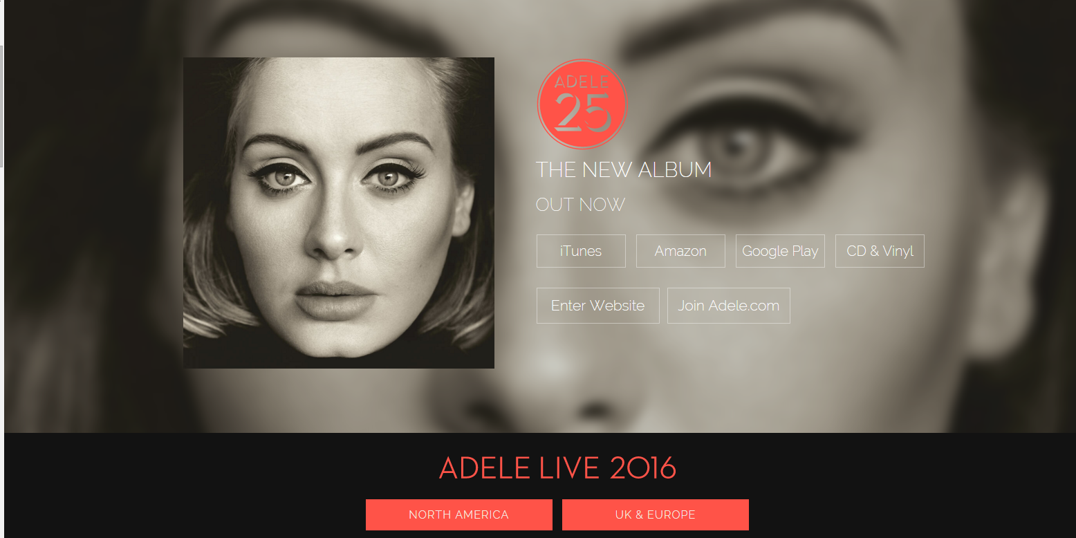 However, I noticed on both my smartphone and my smaller, secondary desktop monitor that some of the options on the top that I could see clearly on my main monitor, including the all important “Enter Website” button, are hidden behind the Adele Live 2016 portion of the page. You have to scroll before you get to those options. Terrible usability.
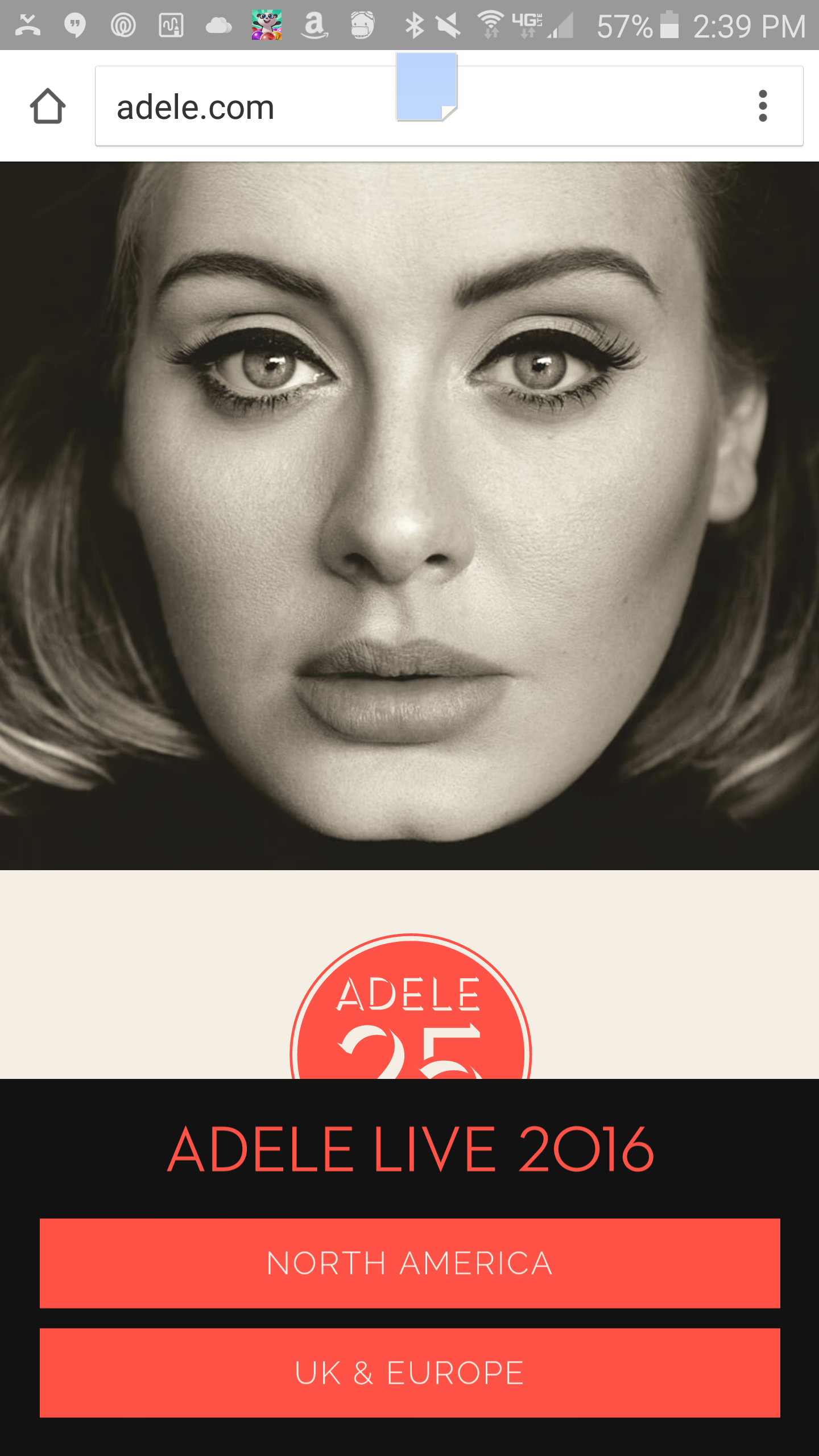
- Navigation. Our CEO Stoney deGeyter recently discussed how, while you should think mobile first when designing your site, you shouldn’t think mobile only. This site provides the perfect example of a site that has navigation designed for mobile that doesn’t take into account the needs of the desktop user. It uses what is called a collapsible, flyout or “hamburger” menu for the navigation. It’s those three lines in the corner of a site that bring up the navigation when clicked.
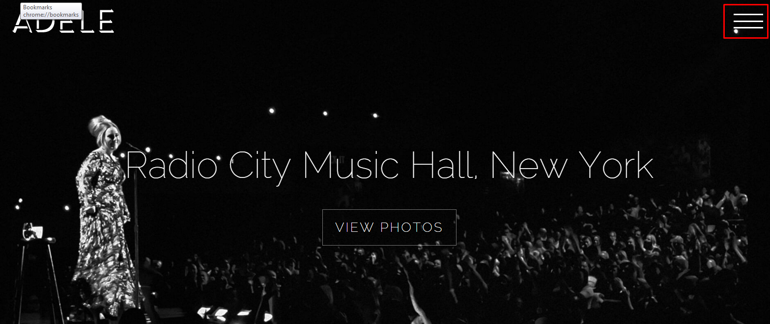 This is fine, and in many cases preferable, for mobile devices because trying to display the full navigation can make for an irritating visitor experience. But look at all that space on Adele’s home page to display navigation! And for the less web savvy, would they even know to click on the hamburger? What’s even worse is what happens when do click on it:
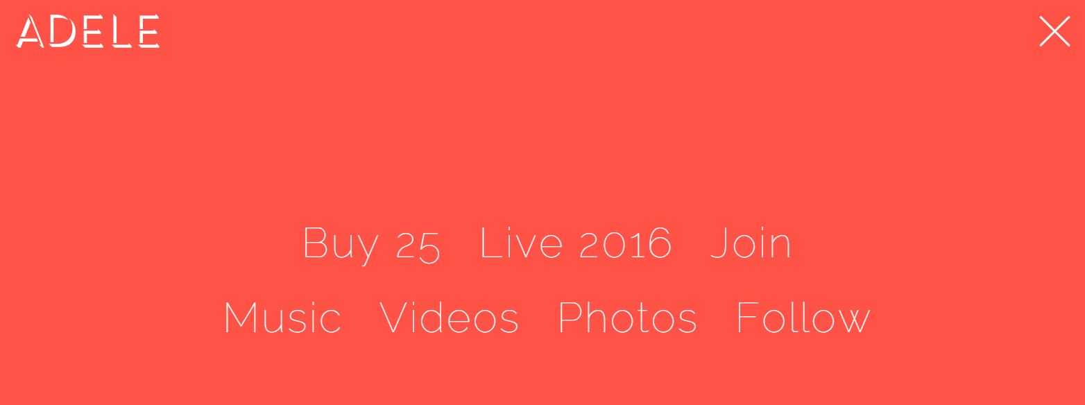 Blech! This doesn’t even look like navigation. Now would the average person be able to figure out that these are the navigation options and click on them? Most likely. But the more you make users think and make it difficult for them to find what they came for, the more likely they are to bail. Now there’s only one Adele, so if someone is on her site, they probably are looking specifically for her stuff, so they’ll hang in there longer than the average user. But unless you are the only game in the web universe, you’ll want to make your navigation as simple and user-friendly as possible. As a side note, this does look pretty good on mobile:
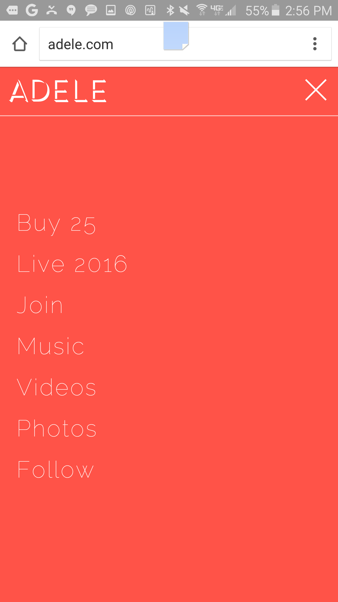
- Social media buttons (or lack thereof). Part of the problem with this funky navigation is that it takes four clicks from the splash page for someone to get to any of Adele’s social media accounts. First, you have to enter the site on the aforementioned splash page. Then you have to click on the hamburger menu, and then you FINALLY get the navigation option “Follow” where you still have to click on the social network you want to follow Adele on. You want to make following your company on social media to be as simple as possible. The easiest way to do that is to provide “Follow Us” buttons for each of the your networks on various parts of your site. This allows visitors to get to the social profile they are interested in with one click.
- What social? While we’re talking social, let’s just say Adele’s presence on social media leaves A LOT to be desired. Her updates are very sporadic (like once every two weeks to a month apart). And what’s posted isn’t anything you couldn’t find anywhere else. There are posts all over social media about her Car Pool Karoake performance. Not that she shouldn’t post it, too, but how about also giving us something more? She is known for being one of the most down-to-earth, personable celebrities, but you see NONE of that on her social networks. She should take a cue from her country music counterparts. Carrie Underwood’s Facebook page is full with behind the scenes photos, her thoughts on the shows she’s performed and even everyday stuff like how she was loving Grease Live and her struggles and joys as a mom. THAT’S social. Or how about my personal idol, Miranda Lambert? I have discovered 4 or 5 new artists simply because she mentioned how much she loves them on her Facebook profile, and I love her pet pics and real life adventures.
- Where’s my Adele swag? Am I to believe that there’s no Adele merchandise out there? No t-shirts? No hats? No beer coozies? How can I go on with life? But of course, there is merchandise out there, just no obvious way to buy it on her site. Huge missed opportunity. Maybe there are fans coming on the site for a souvenir because they couldn’t go to the concert. Or maybe someone thought a shirt would be the perfect gift for their favorite Adele fan. Where are they going to go first? Probably Adele’s site, but as it turns out, they should just go to Amazon like we do for everything else.
As a side note, I really also do not like the setup of the Music page. It may be just a personal preference, but I hate how you have to keep scrolling to see each album. Now, she does not yet have a massive collection, and by the time she does, this website will probably (hopefully) change a million times, but I like to be able to see the whole collection at a glance. For instance, I was on Bon Jovi‘s site the other day and was curious to see how many albums they have made. I could easily see at a glance and enjoyed seeing all the album covers there together. If you want details on a specific album or want to buy it, all you have to do is click on the album cover.
What I liked
OK, like I said, I love Adele, and not that she’ll ever read this or care what I think about her website, I feel it’s only fair to give a few positives:
- Again, even though the splash page clearly sucks, the one good thing is that it puts the information that visitors are most likely looking for (tour and album information) up front and center (as long as you have a big enough monitor to see it all). This is an important thing to keep in mind for your own site. Figure out what information visitors want and make sure it is uber easy to find.
- There is a great, personal story about the creation of 25 at the bottom of the home page. Unfortunately, you have to scroll waaaaaay down for it, but there is a good take away here: Get personal with your website visitors. Tell your story. The more they know who you are and where you come from, the more they will like you and the more likely they are to do business with you.
- The tour page is clean, easy to read and shows the status of all the concerts. Spoiler alert: They are all sold out 😢
- There are a lot of cool photos and videos that show us that awesome Adele personality we’ve all come to know, love and envy.
Anyone Can Have a Platinum Web Presence
It doesn’t matter if you are trying to sell records or widgets. A good web presence is a good web presence. And a bad one is, well, a bad one. If Adele (who can do no wrong in many people’s eyes) can get it wrong, so can the big brands you are competing against. That means if you can create a better user experience and engage more effectively on social media, you can beat the competitors you may have deemed unbeatable. All you need is the knowledge and the ability to apply it (or have someone apply it for you).