
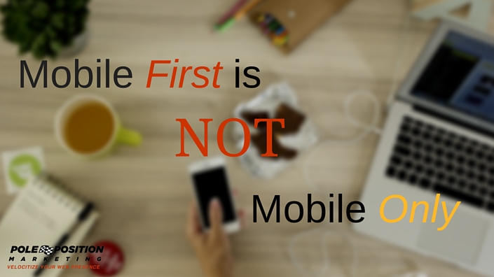
I’ve written quite a bit about mobile design, development and optimization recently, advocating for a “mobile first” philosophy. But going “mobile first” doesn’t mean “mobile only.”
The world is going has gone mobile. All of our website marketing efforts (which includes web design and development–that’s not IT!) need to consider mobile, not as an option but as the primary way their visitors will be interacting with their websites.
In fact, when it comes to websites, we should probably begin devaluing the word “mobile” from our vocabulary. Right now we think of mobile as the device being used. However, from a programming perspective, mobile is turning more into the platform rather than the device itself.
What does that mean to you and me? Well, for starters, we don’t want to create separate websites for mobile and desktop. We can deal with coding tweaks for different browsers –do this for Chrome, that for Firefox, and now (maybe) AMP for mobile–but we don’t want to have to maintain separate websites for every platform.
This Is Not Mobile First
Have you heard of Squawqr? It’s a content management system that helps you build mobile websites. The problem is, these are not websites that are mobile compatible, or even mobile first. They are really mobile only. And not even tablet mobile, just phone mobile.
Clearly, the idea is to create one site that works on all devices. But Squawqr’s solution is plain awkward (or should I have said ‘squaqwrd?’). It creates a site that fits perfectly into your mobile browser, but that’s it. The output on other devices looks much in the same way vertical phone video plays on a TV. It just feels wrong.

Photo credit: http://img.deseretnews.com/images/article/midres/1237371/1237371.jpg
Did someone assume that the world was turning their monitors (and tablets) vertical?
This approach has two other problems as well. First, the entire site is built on one URL. All content, features, actions, etc. are built into the “home” page. This takes us back to the days of flash websites, and it completely destroys the ability to create landing pages that drive visitors to very specific content.
More precisely, it destroys the ability to drive visitors to the very content they are looking for. They land on the site and begin to hunt for what they want rather than landing on the site and having their query resolved right there.
Which brings us to problem number two: Where the heck do you do your content marketing? Where’s the blog?
From what I can tell, the only way to do a blog is to have it on a third party blogging platform on a different URL. Again, from a web marketing perspective this is a setback of at least 10 years!
So why am I harping on this little known platform? Mostly because it came to my attention several months ago and a friend of mine is getting bad advice from a marketing firm pushing it. This is why you need a true web marketing expert involved in building your web site. Developers and off-line marketers may think they know this stuff, but in reality, they know only enough to be dangerous to your business.
Mobile is Marketing
You don’t go mobile first by creating a mobile website. Or even a mobile-friendly website. We still use that language, but in reality the goal is just to create a website that meets visitors needs regardless of what device they are on.
Different devices lend to different strengths. Your site should work toward those strengths when being viewed on that device.
Some say that mobile-only website won’t do any harm, but I beg to differ. True, Google has said that the lack of a desktop-friendly site will not impact rankings, but as I’ve said a gazillion times, rankings aren’t the be all, end all. Failing to have a site that works optimally for mobile and desktop impacts the user experience, even if it’s just a little bit. A perfect example is the site’s navigation. Since screen size on phones is limited, the navigation has to be hidden behind an action button.Trying to display your full navigation on a mobile device harms the visitor experience.But you also need to know that hiding your navigation behind that same action on a desktop monitor also harms the visitor experience. Bigger monitors give you better opportunities to show your strengths.
So here you have a perfect example of how your site should differ on two different platforms. Yet, with some very minor exceptions, the moment your visitors can’t do something on one platform they can do on another, you’ve failed. The site should look and act differently while allowing for the same actions, if not via a slightly different method.
The goal is to use each platform in the best way possible, for the sake of our visitors. We are just going where they are, but we have to do it right. Just showing up isn’t enough.
Going mobile first simply means understanding that the lions share of your visitors are (or soon will be) visiting your site from a mobile device. Don’t make mobile an afterthought, make it a forethought.
But that doesn’t mean make desktop browsing an afterthought either. Your visitors think and act differently depending on the device they use. If you try to go mobile first by forcing them into a mobile-only experience, you’re going to kill your visitor share from any device that doesn’t work perfectly from the device in which it was built for.
3 Responses to Mobile First is not Mobile Only