
Great website navigation requires a great balancing act. You have to provide enough options that visitors can find the information they need but not so many that they become overwhelmed and frustrated.
This balance is also important for your search performance. Too many options mean little or no site hierarchal development that the search engines use in valuing pages and ranking content. But
you have to make sure the search engines can get to any page with as few jumps (clicks) as possible.
This checklist will help you achieve the right balance and conquer other important site navigation issues to make your site more user- and search engine-friendly.
Full Site Navigation Checklist Text
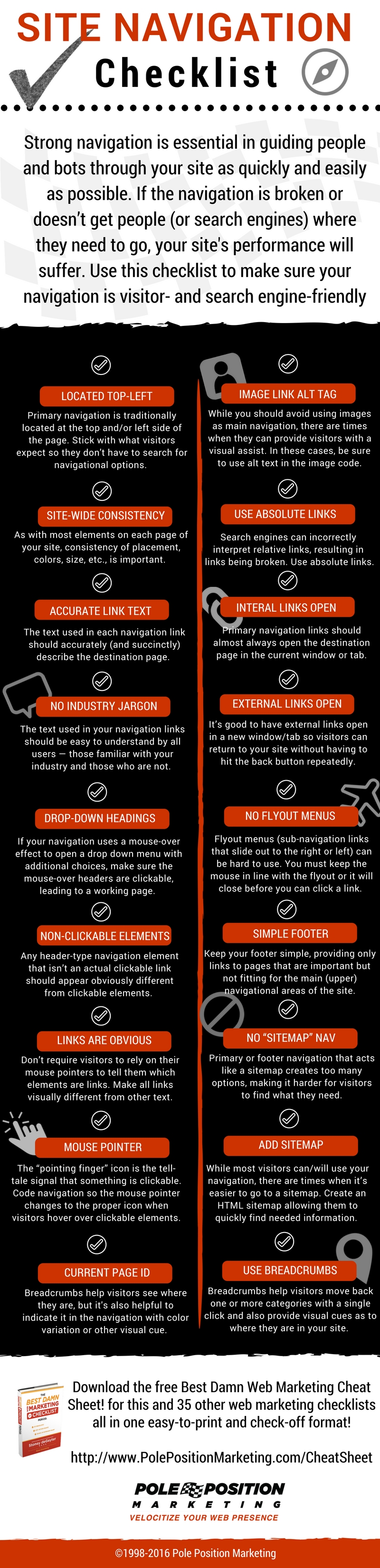
- Primary Nav Located Top-Left. Navigational elements are traditionally located at the top and/or left side of the page. Placing your navigation anywhere else forces your visitors to search the page just to know what navigational options are available. While there are always legitimate exceptions to the top/left rule, use caution when going outside of your visitor’s expectations.
- Site-Wide Consistency. As with most elements on each page of your site, maintain consistency of placement, colors, size, etc. Every change to “static” navigational elements takes the visitor away from the content, which is where they are most likely to maintain engagement with all that you have to offer.
- Easy to Use. Don’t make visitors think too much in order to use your site’s navigation. Simplicity of use requires keyword-rich navigational headings and links, non-frustrating dropdown or fly-out elements (an oxymoron, if you ask me,) and limiting the number of navigational options. Each link should be clear in meaning and obvious as to what content will be available once it’s clicked.
- Link to Main Site Sections. If your site’s services or offerings are broken down into categories, display those categories as your main navigational elements. While other areas of the site might be important, it’s assumed that your products and services are most important of all. Don’t force visitors to click on “services” or “products” just to see what you offer. Instead, present these as the core of your visible navigation. You may have to narrow down or group your offerings into fewer options, but this all goes toward creating a simple navigation that improves the visitor’s experience on your site.
- Link to Key Company Pages. Aside from your main offerings, your navigation must also help your visitors find key company information to assist them in the decision-making process of choosing to do business with you over a competitor. There are a number of pages you can add to your main, visible navigation, but only a handful that are absolutely necessary. All non-essential pages can often be grouped under navigational sub-categories. Here are some of the links that you may want visible in the main navigation:
-
- Home Page
- Contact Us Page
- About Us Page
- Blog
- Login/Logout
- Shopping Cart
-
- Proper Categorical Divisions. When using a large side-navigation with many links, be sure to break the links into categorical groups, rather than showing one long list. This helps visitors quickly scan and focus on an area of the navigation that best represents their needs and wants.
- Accurate Link Text. The text used in each navigation link should accurately (and very succinctly) describe the destination page. You usually have space for one to three words, depending on the navigation format you use. Incorporate descriptive keywords that ensure the visitor doesn’t have to guess what they will find on the destination page once they click the link.
- No Industry Jargon. The text used in your navigation links should be easy to understand by all users — those familiar with your industry and those who are not. Don’t use industry jargon in your links, or use acronyms that may not be understood by non-industry folk. Use language that each visitor will instinctively understand and that hints to the content they will find on the destination page.
- Drop-Down Headings Clickable. Many navigations use a mouse-over effect to trigger a drop down that opens up more navigation choices. Quite often, the mouse-over headers are not clickable links that lead to another page. They should be. Anything that looks and acts like a navigation link should lead visitors to a working page. Navigation elements that don’t “work” feel broken. Besides, these pages can often serve as great optimized landing pages for general category keywords.
- Obvious Non-Clickable Elements. Any header-type navigation element that isn’t an actual clickable link should appear obviously different from the other clickable elements in the navigation. If it looks like a clickable link, the visitor will try to click it, only to get frustrated when it doesn’t work.
- Links Are Visually Obvious. Don’t require visitors to rely on their mouse pointer to tell them what is or isn’t a link. All links, navigational and contextual, should be visually different from other text on the site.
- Mouse Pointer Changes on Clickable Links. Many sites use navigation coding that doesn’t change the mouse pointer to the “pointing finger” icon when it hovers over a link. This icon is the tell-tale signal that something is an actual clickable link. Code your navigation so that all clickable elements change the mouse pointer to the proper icon, so visitors know what is or isn’t clickable.
- Current Page Identification. While breadcrumbs help visitors see where they are in the current navigational trail, it is also helpful for visitors to see which page they are on when looking at their navigational options. This can be done by creating a slight color or other visual change on the link for the page currently being viewed. This visual cue can be a subtle but effective means of helping visitors keep track of where they are in your site.
- Image Links Use Alt Text. You generally want to avoid using images as your main navigation; however, there are times when images in your navigation can provide a visual assist for visitors. When such images are used, be sure to use alt text in the image code that describes the navigation link.
- Use Absolute Links. Absolute links (<a href=”http://www.site.com/page.html”>) create a hard-coded URL to the destination page that leaves little room for browser or search engine misinterpretation. When relative links (<a href=”/page.html”>) are used, problems can occur that can cause the browser and the search engines to interpret the link incorrectly, resulting in the link being broken. Use absolute links to prevent such errors.
- Internal Links Open in Same Window/Tab. Primary navigation links should almost always open the destination page in the current window or tab being used by the visitor. When navigation links open in a new window or tab, the visitor loses the fluid navigational experience and they cannot use their “back” button. If the visitor spends enough time navigating around your site, they’ll end up with numerous open tabs and windows. That’s just annoying!
- External Links Open in New Window/Tab. While not absolutely necessary, it’s a good idea to have any link that points to an external site open in a new window or tab. When visitors follow links off your site, they often wish to get back to it when they are finished with that page. Opening external links in a new window/tab allows them to quickly get back to your site without having to hit the back button repeatedly.
- No Flyout Menus. Drop down menus can make navigating to sub-categories easier. However, flyout menus (sub-navigation links that slide out to the right or left) are often very difficult to use. All too often, visitors are unable to keep the mouse perfectly in line with the flyout, causing it to close before they are able to click the next link. Flyouts are great if you have perfect mousing skills, but otherwise, not so much. However, if you choose to use flyout menus, adjust the timing so when the mouse accidentally moves off the menu item the flyout menu won’t close prematurely.
- Simple Footer. Keep your footer as simple as possible. Footer navigation links should be kept to a minimum, providing links to pages that are important but not fitting for the main (upper) navigational areas of the site. Some typical footer links might include:
-
- Sitemap
- Privacy Policy
- Security Signals
- Promotional Materials
- Social Links
- Accreditations and Organizations
-
- No “Sitemap” Navigation. Your primary or footer navigation should never act as a sitemap for your entire site,unless your site is extremely light on pages (25 or less). While it’s important to give your visitors multiple options that help them reach their destination, a sitemap-style navigation creates too many options for the visitor, making it harder — not easier — for them to find what they are looking for.
- Add a Sitemap. While most visitors can, and will, use your navigation sufficiently, there are always times when the easiest way to find something is to go to a sitemap page. Create an HTML sitemap that allows visitors to quickly find the information they need, without hunting through multiple navigational layers and clicks.
- Use Breadcrumbs. Breadcrumbs are an important ingredient to a complete site navigation structure. Breadcrumbs help visitors move back one or more categories with just a single click, instead of being forced to hunt for the category link in the navigation menu. Breadcrumbs also provide the visitor with visual cues as to where they are in your site, while also allowing them to navigate around a category more easily.