Great content does you and your visitors no good if it isn’t easy for the reader to… well, read. Hidden content, content that gets lost in the page, or content that is laid out in an unfriendly manner, can create all sorts of conversion roadblocks for the visitor. Getting your visitors to read your content is critical to your sales process. Or at least it should be. If not, why have content on your site at all?
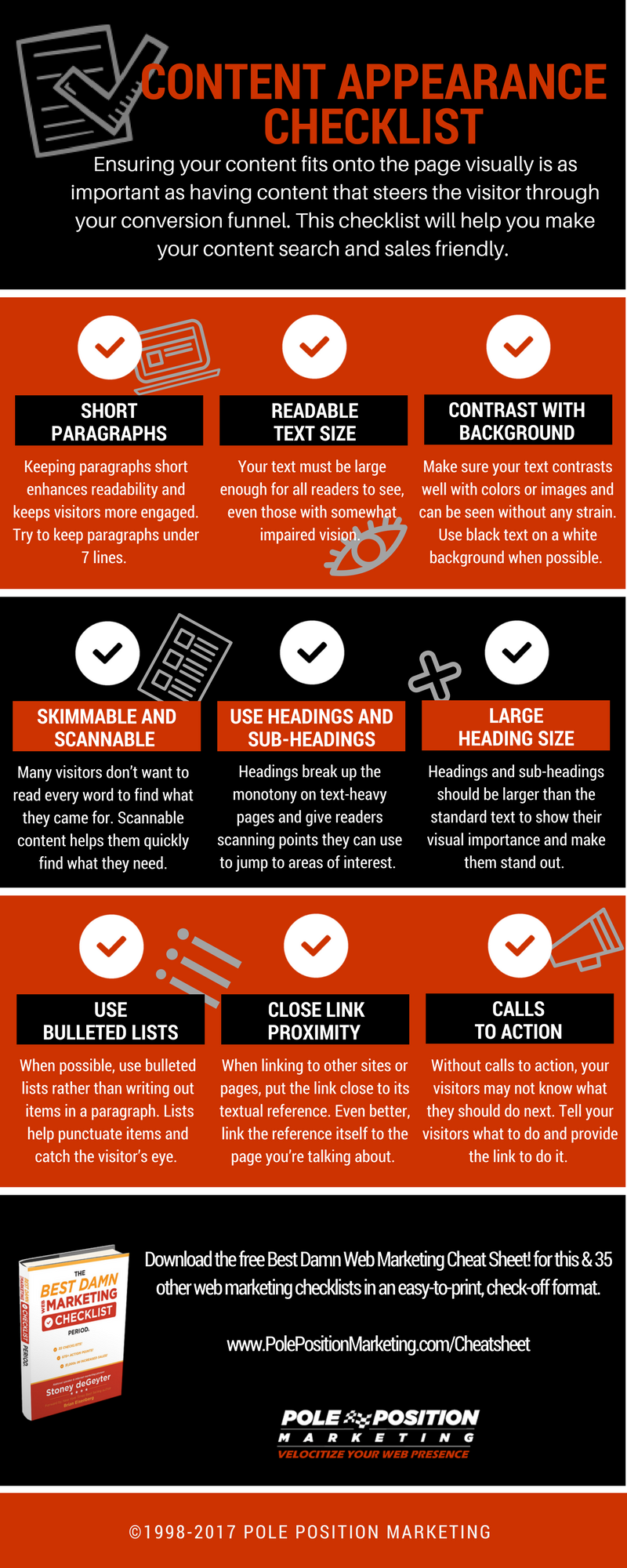
Ensuring your content fits onto the page visually is just as important as having content that does the job of steering the visitor through the site’s conversion funnel. You must be sure it’s not obstructed by non-essential elements and is formatted in a way that your visitors are able to consume it easily. If the visitor cannot, or has a hard time reading the content, then it can’t do the job it was intended to do. Creating easy-to-read, digestible content will bolster your sales process, which is why you’re reading this checklist to begin with.
This list covers aspects of how the content should be displayed visually on your website. While the words themselves matter for the enticement and conversion process, how those words are displayed can determine if they are read or ignored, and therefore whether or not your words will have the impact you intended.