
Developing a mobile-optimized site is now critical to having a truly effective web presence. But mobile optimization is more than just making your desktop site fit a smaller screen. It’s about optimizing the entire experience and making sure the site performs as it should across all devices.
That’s why Pole Position Marketing’s mobile optimization looks beyond your mobile configuration. We have a “mobile first” philosophy, meaning that the mobile version of your site should be treated as the primary version rather than playing second banana to the desktop site.
 “After only 7 months with Pole Position Marketing and a very modest budget, we almost tripled the number of hits on our website and have had just over a 100% increase in our sales.”
–Chris A.,River & Rock Adventures
How We Optimize Your Website
There are three main areas we address when optimizing your website for mobile devices:
Mobile Configuration
There are many routes to having a mobile site, but only two are preferred for long-term marketing value.
- Responsive – Coding that allows your website to adjust for every screen on which it’s displayed. The benefit of having a responsive site is you only have to update one site that will work on all platforms.
- Accelerated Mobile Pages (AMP) – A stripped down version of HTML designed specifically for mobile devices. This more basic version allows pages to load extremely fast.
We will work with you to determine the best route for your website and implement that configuration.
Usability
User experience should be a priority regardless of the device, but there are some unique usability issues associated with mobile devices that we will evaluate:
- Content format – To improve the format of your content, we will make recommendations to make it more scannable, such as making text more concise, increasing font size, and making some content available on demand only.
- Navigation – Traditional desktop website navigation does not work well on mobile devices. We recommend collapsible navigation.
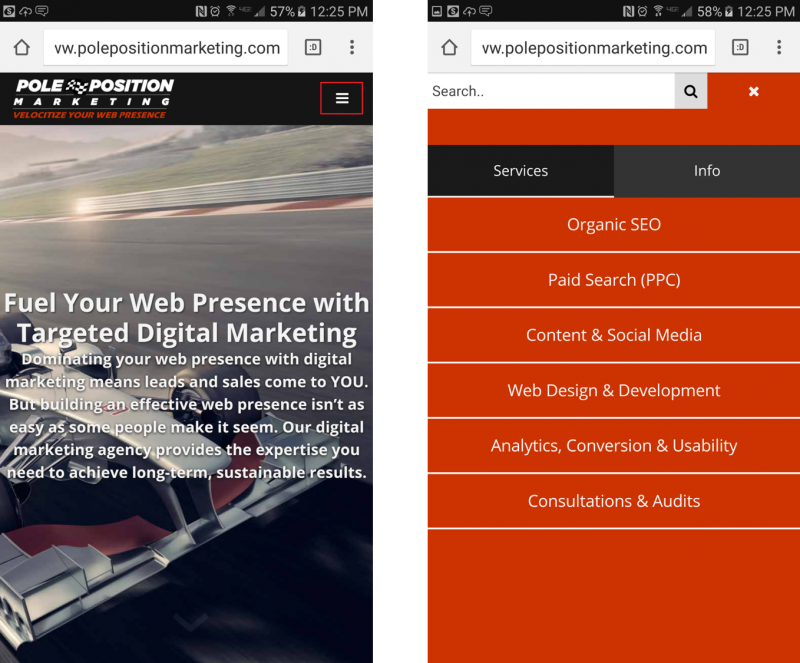
Left: “Hamburger” menu for collapsible navigation (red outline) Right: Opened navigation
- Buttons, links, and calls-to action – These need to be large so they are easy to tap with fingers, which are less precise than mouse pointers on desktop.
Coding
There are a number of coding issues that can cause problems with mobile sites. For the best performance, we will:
- Reduce the number of automated HTTP requests made when the mobile site is loaded.
- Reduce scripts and styles.
- Use CSS instead of JavaScript.
- Make sure your mobile site is not blocking CSS, JavaScript, images, video, etc.
- Eliminate the use of Flash.
- Implement structured data where possible and appropriate.
Pole Position Marketing’s Approach
While we do employ a mobile-first approach, that doesn’t mean disregarding desktop. We will create a site that pleases ALL users as well as the search engines.
 While we do employ a mobile-first approach, that doesn’t mean disregarding desktop. We will create a site that pleases ALL users as well as the search engines.
Don’t alienate your users by making your site only optimal for use on one platform. By having a mobile optimized website, you can cash in on the mobile internet movement, resulting in a larger audience and, ultimately, more conversions.