
Now before you put me in the loony bin for that title, please rest assured I don’t really think you should ditch your navigation. Clear and effective navigation is essential to every website. However, you should never rely on your site’s navigation alone to get your visitors to the information they want. In fact, as a general rule of thumb, your visitors should be able to navigate effectively through your site if you removed the navigation entirely!
Every Page Needs a Purpose
When developing or optimizing a website, we try to make sure every page has a very clear purpose. Once you know the purpose of a page, you can then develop the message (content) around that purpose. First and foremost, the visitor must feel the page satisfies the need that brought them there.
But besides providing great content, the purpose of each page should provide an indication as to what should happen next. Should the visitor leave your site, or is there a greater purpose that goes beyond that page? In short, the purpose of the page helps move the visitor to the page, content or solution that helps them achieve their purpose.
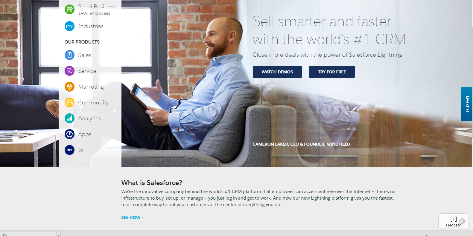
Take for example the Salesforce home page. The main actions someone would likely want to take are right there within the content of the page. Right away, you are given the option to Watch Demos or Try For Free. But what if you don’t know much about Salesforce and are not sure you are ready to watch the demos (which you have to complete a form to do) or start a trial? No problem. They have a short explanation about what they do with a text call-to-action (“See How”) where they can learn more.
Content-CTAs=Worthless
Too many web marketers focus on developing content but not on the action that the content should be driving the visitor toward. Yes, great content is an important part of that process, but providing content without an action for the visitor to take next is ultimately pointless. Both for you and for them!
Just as much as a reader doesn’t want to go back to the table of contents to find out which chapter they should read next in a book, you don’t want your visitors to be forced to go back to the navigation to determine what page to visit next. That completely disengages them from the conversion experience.
Link Early and Often
Each visitor should be presented with options within the content they are reading that will drive them to one or more best options to keep them on their journey. Any time your content presents an opportunity for a visitor to gain more information somewhere else, add a link to that information on your site. And if the visitor gets to the end of the content, make a path to the next logical thing for them to do or page to visit.
We have a restaurant here in Northeast Ohio called Danny Boys that does this rather well:
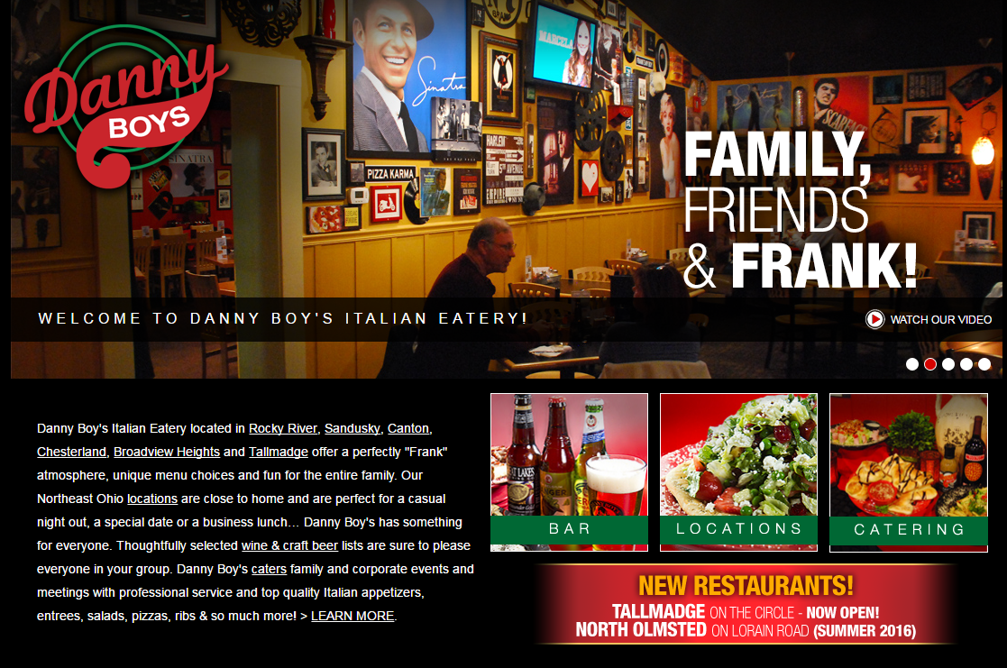
Each location mentioned in the intro paragraph is linked to the menu for that location, as are other presumably popular pages for wine & craft beer and catering.
By adding these contextual links, you’re giving your visitors the option to stay engaged with your business. It not about giving them every option possible but giving them the options that help them move toward having a successful on-site experience.