Everything we do on our websites come down to one thing: conversions. Whether that’s getting someone to purchase a product, engage a service, download an ebook, give us a call, or just click on an ad, it’s conversions that drive our businesses. Without them, your business website is really just a hobby.
One of the most critical elements for facilitating those conversions is your website navigation. Granted, the navigation is far down the line of assists; however, without the navigation, most players won’t even find their way out onto the playing field.
There are a lot of components to making your navigation work for your visitors, but there are three big mistakes that you’re probably making right now. And those mistakes are killing you!
Not Performing Keyword Research Before Outlining Your Site Navigation
People often think of keyword research as something you do to optimize web pages, but it’s value goes far beyond that. And before that, really. Knowing what keywords searchers use when interested in what you offer is a critical starting point for creating a website navigation that actually benefits them.
A lot of businesses build their navigation menu items using industry jargon or other not-so-common terminology. That may work for searchers who are already intimately familiar with your products and services as well as the related problems and solutions, but it doesn’t work for someone who’s an outsider to your industry.
Keyword research will show you how often people search using insider versus outsider language. And more times than not, it’s the outsider terms being searched most frequently.
But keyword research can even help you determine which product/service categories are needed. You may think it’s enough to have a “boots” category, but when keyword research shows you people are searching for “hiking boots,” “riding boots,” and “mountain boots” in significant numbers, this can tell you that it may be worthwhile to add these categorical distinctions to your navigation.
Get our free Keyword Research & Selection Ebook and Spreadsheet Tool
Focusing On Yourself Rather Than Your Customer’s Needs
The primary goal of a website’s navigation is to help visitors find what they need. About us, contact us and blog links are all important, but those don’t meet the visitor’s primary needs. What did they come searching for? If it’s a specific product or service, why do you have “about us” as a primary link rather than the actual product or service category they are interested in?
Supporting pages such as these should be put in a supporting navigation role. The primary (i.e. most obvious) navigational elements should focus on your main product or service categories.
You’ll want to categorize your products into a handful of primary categories. If you can’t get your primary categories down to five or six, then you should display your most in-demand categories. Leave an option to view the rest as well, but keep the important ones front and center.
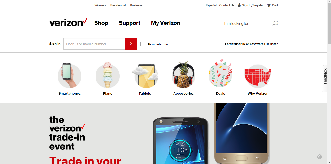
You can see an example of this on Verizon’s home page. Rather than having generic “products” and “services” categories that you have to click on, it provides it’s main types of products (smartphones, tablets, accessories) right near the top of the home page and a link to “plans,” which is the service most people are looking for.

By displaying your main offerings boldly in your primary navigation, you allow every visitor to see what you offer regardless of which page they land on, and without having to click a link that reads “products” or “services.” (This won’t be the case with mobile, but again, once someone does click on the navigation, make sure they see these before they see “about us.”) Not only will it help them find what they want sooner, but it shows the breadth of your offerings at a glance.
Using a Mega Menu
I’m not sure whoever thought mega menus were a good idea, but it never really was. Not from an SEO perspective, and not from a usability perspective. Bottom line is that the mega menus dilute the navigational experience.
Most people, when presented with too many options, will not take the time to read each and every one of them to see where they need to go next. Instead, they’ll click on the first link available or take a pass completely. More options results in less clicks rather than more. Instead of making everything easier to find, it buries it in information overload.
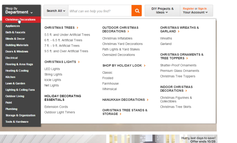
You’ll see a lot of this on retail websites. For instance, check out this gem on Home Depot’s site. Yikes!

Use your navigation to engage the visitor. Show them fewer options on the onset, and once they engage, offer more options specific to their first click. This helps lead them in the direction they want to go, rather than giving them every possible option before they even know what they really need.
[inlinetweet prefix=”” tweeter=”” suffix=”@StoneyD”]Your site navigation belongs to your visitors, not to you. Do what makes sense to them[/inlinetweet], not what makes sense to you. If you’re making these mistakes, there is a good chance you’re creating more problems than you’re solving for your visitors. Which means you’re creating problems for yourself as well. And that just doesn’t sell!
