
Though overlooked by many, calls-to-action (CTAs) are powerful tools for every marketer. A call-to-action is the wording or graphic that guides users towards the next step in your goal conversion. How you construct it and where you place it can make a huge difference in creating conversions and generating leads. [inlinetweet prefix=”” tweeter=”” suffix=”@shane_barker”]Whether you want users to subscribe, buy or download, content should always be followed by compelling CTAs.[/inlinetweet]
A study of over 200 small businesses based in the U.S. revealed that more than 70% of them do not have clear CTAs. Researchers also found some interesting facts given below:
- 82% of the study subjects didn’t reference their social media profiles.
- 72% of them didn’t have a call-to-action on their interior site pages.
- 27% didn’t display their phone number on the home page.
- 70% of those who did have a phone number didn’t have it prominently displayed.
- 96% of them didn’t include a how-to guide on their homepage.
- 68% didn’t have their email address on the homepage.
- 38% of those who did include their email address didn’t display it prominently.
As you can see, many businesses aren’t implementing proper CTAs on their websites. This means that they aren’t giving their site visitors enough direction on how to stay engaged with their organization. Visitors are left hanging without any idea on what to do next, resulting in them leaving the site altogether.
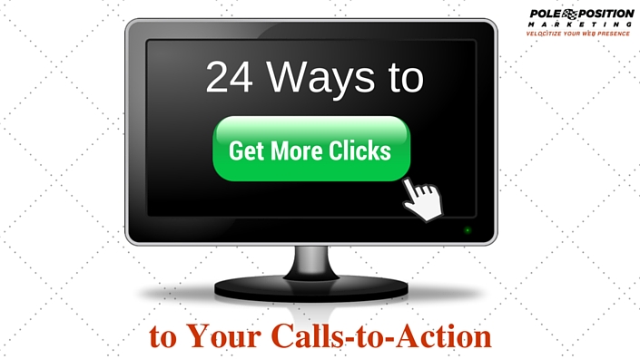
Examples and Types of Calls-to-Action
So how exactly will you create a compelling CTA for your website? [inlinetweet prefix=”” tweeter=”” suffix=”@shane_barker”]Take a look these 24 easy tips for improving your CTAs and getting more clicks:[/inlinetweet]
- Pick the right colors – The color of your button plays an important role in the performance of your CTAs. Some colors have been known to convert better than others. Orange boosted the conversion rate for SAP by over 32.5%. Performable saw an increase in conversion rate by 21%. Green and orange are among the top-performing colors. However, your overall site design matters the most in the end. Always opt for contrasting colors that stand out and attract attention.
- Use legible text – Make sure the button text is large enough for viewers to notice and read easily. At the same time, avoid making it too large so that it looks obnoxious or intimidating.
- Write specific content – Actionable copy that touts specific benefits, uses and keywords are likely to garner more clicks. Hubspot is a good example of this:

- Keep it clear and simple – The text on your CTA shouldn’t go on and on. Make the text short and sweet, but not too short that viewers don’t know what exactly you’re trying to convey. Aim for somewhere between two and four words.
- Be action-oriented – Each call-to-action button should intrigue and compel viewers to take action. Try replacing overly used words like “enter” and “submit” with words like “reserve” and “get.” Choose words that relate to your offer, such as “get a free trial” or “download our free sample.”
- Add special effects – Specific effects can be a great way to draw the user’s eye to your calls-to-action and get more clicks. For example, you could design a button that wiggles as visitors scroll over it.
- Use whitespace – For a prominently displayed CTA, avoid adding too many elements around it. Leaving whitespace around your button is an effective way to make it stand out and get more users to click on it.
- Create authentic urgency – When creating urgency in your marketing efforts, make sure you’re being authentic. Be subtle, yet clear when you implement this in your CTAs. You could give limited time offers like “First 100 subscribers will get a free eBook.”
- Be specific – Don’t confuse viewers with vague call-to-action buttons that don’t have important information. Try to be more specific by mentioning benefits or other details regarding your offer.
- Remember that size matters – Your CTA button should be large enough that viewers have no difficulty finding it. However, avoid making it threateningly large as users might hesitate to click.
- Choose the right shape – Rectangular CTA buttons are popularly used, but buttons with rounded corners can be just as effective. Since these buttons point inwards, they draw attention to the text inside.
- Remain relevant – Make your CTAs relevant for users to know why exactly they should click the button. Instead of using common text like “See more,” 9gag uses “I want more fun”. This creates more excitement and compels users to click the button if they want to see more funny photos.
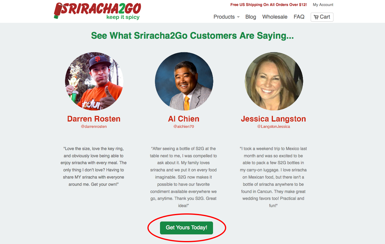
- Show proof – Don’t force viewers to assume how clicking the link will benefit them. Show them the direct value. For instance, a marketing consultant could provide proof of a real client who benefited their consulting. This would persuade more people to click on the call-to-action button.
- Interact with your visitors – Avoid being generic because users want engagement with real people. Try to understand the thought sequence of your visitors so that you can reach out. For example, a real estate website could use words like “Start your virtual tour” or “Take a tour today.”
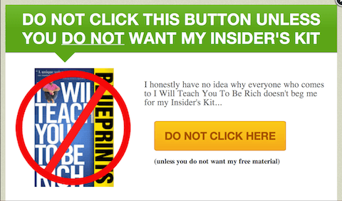
- Use reverse psychology – While most websites tell people to “click here,” you might be able to get more clicks by telling viewers not to click. This strategy was implemented by TimothySykes, which told users “don’t click here if you’re lazy.” It had a 39% better performance than a regular “click here.”
- Express your creativity – Your CTAs don’t necessarily have to be a button. Brainstorm other unique options that could intrigue visitors enough to click. You may want to try placing it within a video to gain more interest.
- Have good timing – Rather than display your CTA right away, you could delay it until after visitors get a clear idea about what you’re selling. Users might feel more compelled to click on the button when it does show up.
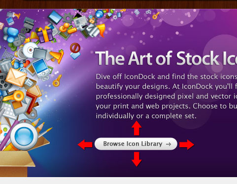
- Focus on design – How you design your call-to-action button can have a big impact on your click-through rate (CTR). Adding images with the text could give users a better idea of what they’re buying.
- Use first person speech – A study conducted by Michael Aagard of Content Verve showed that switching from second person to first person increased the number of clicks by 90% on average. Stick with “I,” “we,” and “our” to personalize your button.
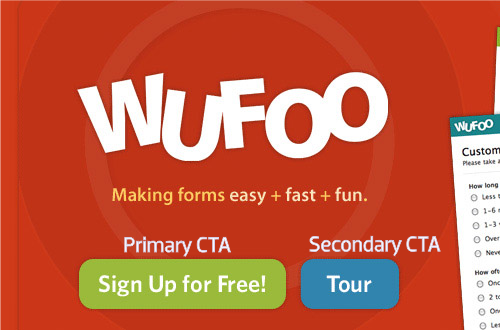
- Prioritize– You might have other buttons on your website that aren’t the main CTA button. Make sure your CTA is more prominent and grabs more attention than other secondary buttons.
- Insert graphics – Adding eye-catching graphics like arrows to your button can have a positive impact on your CTR. However, it’s important that you opt for graphics that are relevant to the action requested.
- Run tests – There isn’t a single call-to-action button that works for every business in every industry. This makes it vital for you to run a test on various buttons. Multivariate testing would help you see which color, shape, design and text works best for your company.
- Keep it minimal – Keep in mind the old adage that less is more. Your CTAs should be short to avoid confusing users with too many choices. If you do want to add multiple choices, limit it to three or four.
- Pick your position – Placement is one of the most crucial elements that affects your click-through rate. There are many places where you can add your CTA button depending on the type. Try testing several locations to see which works best.
Where to Place Calls-to-Action
Like I mentioned in the last tip, positioning of your CTA can have a huge impact on the number of clicks. Although many marketers say that placing it above the fold is the most effective, that isn’t always the case. Your button placement should be determined by the type of content you have and your page design.
The company Trampoline Plezier was able to increase clicks on their website from 21.8% to 33.02% by moving their call to action button button to “just above the fold” after using Hotjar’s heatmap to analyze user behavior.
Overall, the placement and prominence of your CTAs play a pivotal role in generating more clicks.
Have any more suggestions or questions? Let me know in the comments section below!
 About the guest blogger: Shane Barker is a digital marketing consultant, named the #1 social media consultant in the nation by PROskore Power Rankings. He has expertise in business development, online marketing and is an SEO specialist who has consulted with Fortune 500 companies, government agencies, and a number of A-list celebrities.
Social Media Profiles
Twitter: https://twitter.com/shane_barker
Facebook: https://www.facebook.com/shane.barker.14
Google+: https://plus.google.com/+ShaneBarker1
Instagram: https://instagram.com/shanebarker
Linkedin: https://www.linkedin.com/in/shanebarker
One Response to 24 Ways to Get More Clicks to Your Calls-to-Action