

This is part of the Total Usability Series that was originally published in 2007. A decade later, usability is more important than ever, so we are revisiting this series and updating all of the articles. This post was updated 11/30/2017.
We’ve been talking throughout this series about how to make your website more usable. As search engine algorithms get more sophisticated, usability becomes more and more important. Search engines want to please users, so the more your site is able to do that, the better its search performance will be.
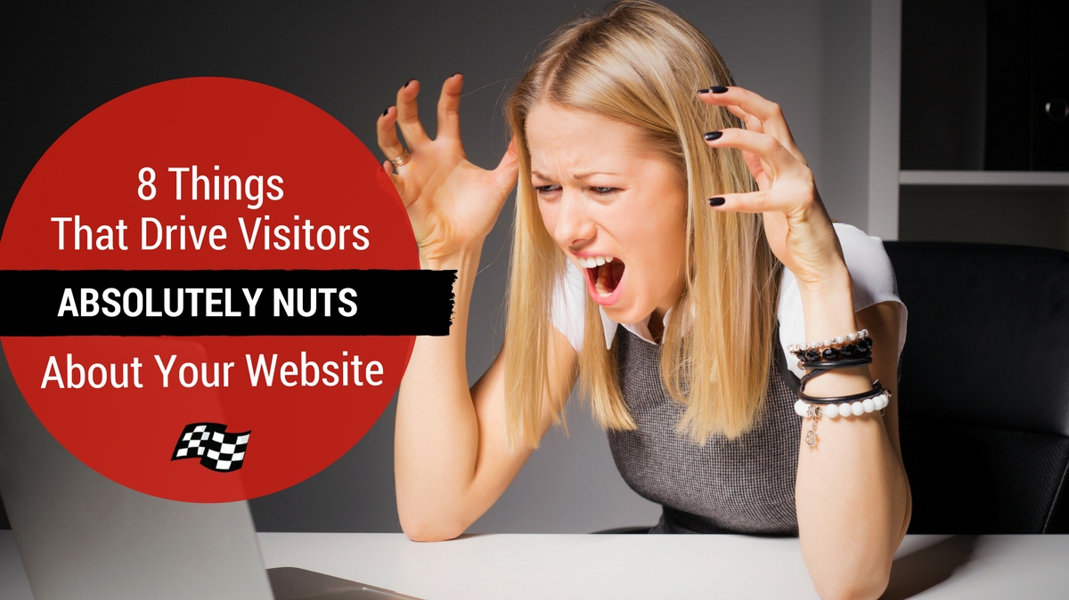
We’ve covered a lot of the “dos” of usability in this series, but in this post, I want to explore the “don’ts.” These are common issues we see on websites that hamper usability and can damage businesses’ search performance. Worse of all, these things can truly drive visitors nuts…and straight to a competitors’ website.
1. Hidden Information
Visitors come to your site for a reason. Maybe they’re researching a topic, seeking to gain information, or are comparing differences between your offerings and a competitor’s. In any case, your visitors are often searching for something specific, and maybe they even want to take action once they have the vital pieces of information they seek. Maybe that information is product specifications, pricing info, or perhaps just a phone number or email address.
Many sites hide or fail to provide this vital information, providing only the most basic information. Or it’s there but buried in the midst of a lot of text or in hidden links. Nothing makes visitors flee faster than hiding important details or contact information!
2. General Confusion
It’s practically the mission statement of digital marketing : Don’t make them think. Heck, a book was even written about it. But some businesses just aren’t getting the message. We still constantly see sites with cluttered layouts, unclear navigation, missing or competing calls-to-action, and complicated industry jargon.
When a visitor arrives on your site, you want it to be very clear who you are, what you do (explained in layman’s terms), and what they should do next every step of the way. Navigation and design should be consistent, and every page should have a purpose. Don’t make them think about it, and don’t make them work to give you business.
 Not sure if your website passes the usability test? Get a Conversion & Usability Audit to have your site assessed and get customized recommendations to improve your user experience.
3. Slowness
A number of things can contribute to a slow website: poorly implemented code, excessive code bloat, extremely large images, etc. Whatever the reason, you need to get to the bottom of it ASAP. Visitors are not going to just hang out waiting for your site to load. If it takes to long, they’ll go somewhere else.
Site speed is also a Google ranking factor, so neglecting speed issues can impact your search performance, too.
4. Broken Links
Having broken links is like a rental car that breaks down halfway through the trip. Links are how visitors travel through your website. If you’ve compelled them to click a link on your site, you want to be sure they get to where they want to go.
Be careful about changing URLs, and be sure to implement the proper redirects when you do. Also, be sure to perform regular broken link checks on your site.
5. Intrusive Popups
This one’s a little controversial because invariably someone will read this and think, “But they WORK!”
I have no doubt that popups can help increase signups, but when done wrong, the damage they can cause to the visitor experience is not worth it.
Don’t get me wrong, not all popups are bad. We use one on our own blog that encourages people to subscribe to our posts as they are finishing reading one.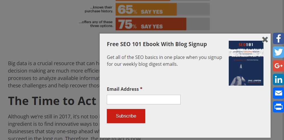
What really gets on visitor’s nerves, though, are the ones that appear immediately and block the content. How do they know if they want to subscribe before they’ve even read the content? If this results in increased bounces, less social shares, and reduced engagement with your site overall, your site could take a search engine hit, not to mention that you could get hit with Google’s mobile interstitial penalty.
Another similar feature that is walking a fine line are popup chat boxes. Chats are a great tool to provide immediate answers to customers at critical points in the sales process, but ones that ask them if they need help immediately when you enter a site can appear stalkerish and are akin to the retail sales person who won’t just let you shop.
OK, rant over.
6. Autoplay
Who hasn’t been the victim of an inopportune autoplay? And it always happens when your speakers are set to near full blast, right?
Sure, you want people to watch your video, but putting it on autoplay can instead send them racing for the exit button.
7. Unnecessary Bling
Even with minimal coding skills, you can do some amazing things on websites, especially with the proliferation of free sites that help you build videos, gifs, images, etc. But just because you CAN do something doesn’t mean that you should.
Multimedia can be a great way to enhance your site and engage visitors. But before you add any flashy element to your site, ask yourself if it enhances your message and goal or if it detracts from them.
8. Long blocks of text
On the other end of the spectrum are sites that have nothing but lines and lines of text. Often this endless content is littered with the industry jargon discussed earlier.
People don’t read the same way online as they do printed material. They tend to skim and scan, looking for the specific information they want. Long blogs of text are a huge turn off and will likely turn visitors away.
Write content as concisely as possible, using headings, subheadings, bulleted and numbered lists, etc., to break up your text. Add compelling images, videos, and other visuals to entice visitors to read…but again, don’t overdo it.
Think Like a User
These may seem like fairly obvious no-nos, but we’ve seen companies time and again commit these usability sins. The key is to take a step back and see your site through a user’s eyes. How would you feel if you encountered your website “in the wild.”
The problem is, it’s hard to see your website through objective eyes, so consider a usability audit or user testing. Even just watching a family member or friend trying to use your site can open your eyes to potential usability issues you might never see yourself.
One Response to 8 Things That Drive Visitors Absolutely Nuts About Your Website