
Believe it or not, there are some aspects of branding that only science can shed light on. From designing your logo to providing a consistent brand experience for your customers, branding psychology can help you get ahead of your competitors.
Concerning visual branding, there are some lesser-known branding concepts giants such as Nike, Apple, and Google have always been using. The effects of these factors have been so huge, you’ll want to use them in your own branding efforts immediately.
Today, you’re going to learn about three specific visual branding techniques that big brands have been doing for years and that psychology has recently shed light on.
#1- Space and Time
Remember the famous PC vs. Mac commercials? Remember the controversy over how outdated PC was and how cool and modern Mac is?
Let me refresh your memory:
Well, one aspect that makes this a successful commercial is how it takes advantage of a phenomenon called space-time representations. Basically, one of the applications of this phenomenon for branding is that the way a product is placed horizontally has a correlation with how old or modern it looks.
In the study “The Future Looks ‘Right’”, researchers found that in the horizontal placement of objects, the objects that are placed on the right-hand side convey a sense of present or future. On the contrary, the objects that are placed on the left-hand side of the screen are considered old or traditional.
According to the study, this is true about English speakers who write from left to right. So for the cultures that write from right to left, left conveys a sense of future and right is traditional.

In what you see above, PC conveys a sense of oldness and past, and Mac (which is dressed up so cool) conveys a sense of modernity, future, and most importantly, transformation by standing on the right-hand side of the screen.
Transformation is one of the most potent means of persuasion. As Consulting.com explains in an article on starting a consulting business, it’s all about helping people solve problems and move from their current state to their desired state. And the more valuable that desired state is to someone, the more they are willing to pay for help getting there.
#2- Upward Diagonals
Look at the logos below. Do you think the use of the upward diagonals in them is accidental?
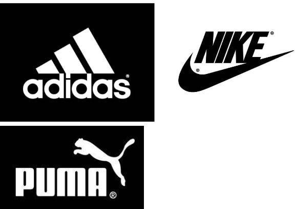
Research has found that upward diagonals imply activeness, youth, or energy, and downward diagonals imply a state of inactivity or relaxation.
If your brand manufactures sports shoes, which are you trying to convey? Activeness, youth, and energy, or inactivity and relaxation? Of course, it’s the first one. And the use of upward diagonals helps you convey that state.
This is what many giant brands such as Nike, Puma, Reebok, and Adidas have noticed, rather intuitively, and used in their logos.
On the contrary, if you think your brand should convey a sense of relaxation, you can use downward diagonals in your logo design to convey that. If you still don’t know your brand image or how to convey it right, consider talking to an expert consultant.
3- Sensory Correspondence
This one involves a little more common sense.
You know that different types of senses might correspond with each other. For example, blue is a cold color, orange is a warm color, a song is bitter or maybe sweet, and ruggedness could convey violence.
A study found that having corresponding sensory modes in place gives customers a better shopping experience. For example “the scent of lavender combines well with slow-tempo music (both low-arousal), while the scent of grapefruit combines well with up-tempo music (both high-arousal).”
So a great way to provide a consistent brand image for your customers is finding correspondences between different senses you’re trying to invoke in your branding efforts.
Another example of the use of corresponding sensory modes is related to packaging. Another study found that the way we understand a product’s weight is related to its color’s lightness: A product with a light color seems to be light in weight, and a product with a dark color seems to be heavy in weight.
If you’re trying to convey a feeling of heaviness with your product, you can take advantage of dark colors. And on the contrary, if you’re trying to seem a little light, you can use light colors.
It’s also important to mention that the color itself (e.g., blue vs. red) did not have any effect on people’s perceived heaviness of a product.
Another important element that affects the perceived heaviness of a product is the vertical placement of it or its image. For example, the images or products that are placed on the bottom of a visual field (product packaging, or store shelves for example) are perceived heavier than the images or products placed on the top.
Finally:
If you’re one of those people who think life is too short for ill-advised practices, then science is your best pal. It has its logical answers for almost anything.
If you’re willing to know what life/business strategies are fit for you, you can find your answers by taking a personality test. If you’re willing to know how to best increase efficiency in the workplace, or even how to interact with people on social media, there’s no better resource than social psychology. Want to have healthier conversions from your website and increase sales? Check out GoodFirms’s web design research that explores the latest trends and best practices for having a conversion-optimized website. As they have noted, “if your conversion rate is low and and bounce rate is high, be sure that you’re in sheer need of redesigning your website”.
And finally, if you want to provide a brand image that is consistent, and relevant to your audience, you need to take advantage of the scientific tactics explained in this article.