
 This is part of the Total Usability Series that was originally published in 2007. A decade later, usability is more important than ever, so we are revisiting this series and updating all of the articles. This post was updated 8/31/2017.
All too often during the design phase of building a website, we find that the end result is really nothing more than what somebody decided “looked good.” In some cases, it’s a combination (or compromise) of what a handful of individuals have determined to be “good enough.” What many fail to realize is that web design and visitor usability go-hand in-hand.
 Web design and visitor usability go hand-in-hand
How the site is developed, along with the underlying coding structure, plays a significant role in whether your site meets the usability requirements of your audience. Below are the factors that must be considered in every website design. While each plays a minor role in the total usability of a website, together they add up to be much more than the sum of their parts.
Meet Visitor Expectations
It’s not enough just to look good. Your target audience will have certain expectations of how your site should look, feel, and work. You need to meet those expectations.
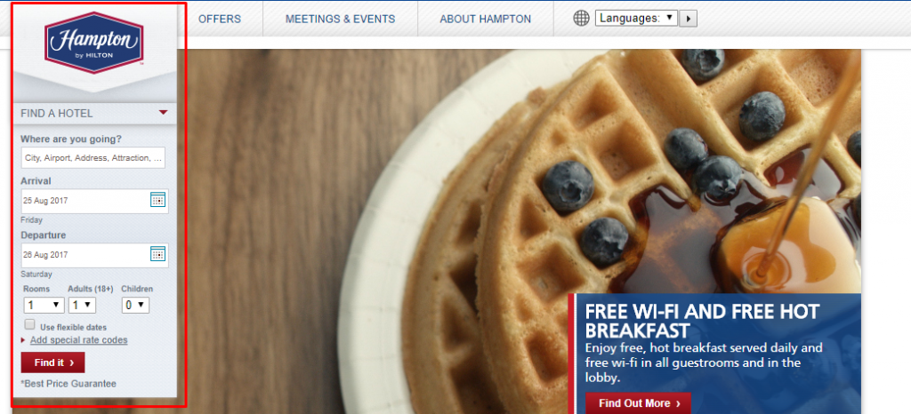
Those expectations may be derived from their experiences with other sites in the same industry. It’s important that your site’s design is consistent with best practices and usability guidelines established by other sites in the same industry. For instances, on a hotel website, visitors will likely expect the area where they can find vacancies to be near the top of the home page.
 Simplicity and Clarity
Keeping the website design simplified keeps visitors interacting with your website rather than hunting through unnecessary design elements. Reduce visual noise as much as possible and utlize white space to your advantage. Buffer’s clean design, for example, makes calls-to-action and other important elements stand out.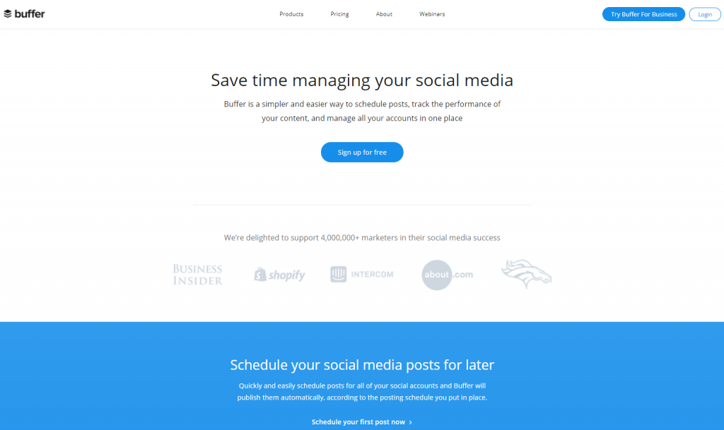
Along with this, the information on your site, including content, navigation, product categorization, and site-search, must be clearly laid out and easy to understand, effectively ushering visitors to the areas of the site they need. Specifically, you want to make sure that links to contact, about us, and other customer support pages are easy to find and obviously accessible to all visitors from any page of your website.
Finally, sentences should be kept short (under 15 words) in order to enhance overall comprehension. Backlinko is known for doing this with their “Bucket Brigades,” short words and phrases that grab attention, followed by a colon: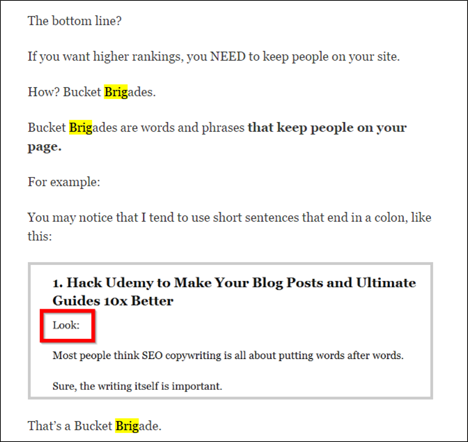
Links
Links are an essential feature that helps visitors navigate your site. Here are some ways to make them as effective as possible:
- Make sure they look like links. Links should be underlined and also differ in style and color from other text in another way. Using a blue font color used to be the standard, but now it’s common to see sites utilize other colors and styles to differentiate links.
- Add descriptions, such as link titles and alt attributes, within each link to help overall usability. They provide a reference for what should be expected if the visitor clicks the link. Encompassing more descriptive text within the link text is also highly valuable.
- List them. When referencing specific areas of your site and/or products all in a single paragraph, it can be beneficial to break links to those pages into bulleted lists. This allows for easy scanning for desired information.
- Use breadcrumbs. Breadcrumb menus allow visitors to always know what page they’re on as well as their location in the overall site structure. Breadcrumbs also allow them to navigate back to previous pages in the hierarchy. These visual cues enhance the user’s experience, even if not actually used.

Fonts
The fonts you use can make or break your site’s usability. After all, if they can’t read your content easily, what good is it? Here are some things to consider when choosing fonts:
- Size. Font size should rarely be less than 10 points. Larger fonts are easier to read, which can help gain conversions.
- Face. The Verdana font was developed specifically for web use for its ease on the eyes when viewed on a computer monitor. Serif fonts, such as Times, should be avoided.
- Number. Going back to the simplicity of the site design, keep the number of fonts used to a minimum.
- Scalability. Allow visitors to resize the text size in their browser by using scalable rather than fixed-width fonts.
Make It Easy on the Eyes
In addition to the fonts, there are a number of other elements that are important to make your site easy to read:
- Paragraph width. Using a fixed-width website design can improve readability of content. Variable width designs cause sentence stretching, making it more difficult for the reader to maintain their place as they read.
- Visual cues. Besides color, you should use other visual cues, such as the size and position of items, to help visitors find the most important information and effectively scan your site. Specifically, action items should be visually different from other elements of your site.
- Contrast. Provide significant contrast between text, background, and other elements on the page. Dark text on a light background is preferred for easy reading.
- White space. Again, websites should use white space liberally and avoid cramming pages with too much information.

Functionality
There are a couple functional issues you need to be aware of. First, you want to make sure your site is not disabling visitor’s normal browser functionality, such as right-click mouse, back button navigating, and forcing links to open in new or resized browser windows.
Also, make sure that your web pages are printer friendly. Utilize CSS to ensure that any page when printed is easy-to-read.
Things to Avoid
Unless you want to send visitors off running for a competitor’s website, don’t use any of these:
- Saturated colors. Such colors can quickly cause eye fatigue, forcing the visitor off the site looking for more browsable websites.
- Obnoxious animated graphics. Repetitive animated graphical content is distracting and reduces retention. Avoid any animations that don’t specifically enhance the user-experience and keep visitors focused on what’s important. In fact, only use multimedia in general if it enhances the visitor experience.
- Horizontal scrolling. The site design should never require visitors to scroll horizontally when the browser is in full-screen mode. All information should be assessable with only vertical scrolling required.
User Focused Design Increases Conversions
When it comes to improving usability to achieve higher conversions, there is no more obvious place to start than in your website design. More often than not, we’ve seen websites undergo a complete user-friendly redesign and then find their conversion rates jump overnight without any additional traffic being brought to the website. Usability should not be an afterthought to the design process. It should be on the forefront, driving the design from the ground up.
Need a full-site usability analysis? Pole Position Marketing provides comprehensive conversion and usability audit to help your site succeed. Request one today!