This post was originally published 4/13/2015. Due to its popularity, it was updated with new tips on 1/4/2018.
There’s no doubt that having a good shopping cart/checkout system in place is valuable to your visitors and vital for maintaining strong site conversion rates. But what could be equally important as your checkout process is what happens when your visitors are adding products to their cart.
What NOT to Do
Many ecommerce shopping cart systems do one of two things when a visitor adds a product to their cart:
- The visitor is moved to the shopping cart where they see all their products. This forces them to navigate back to where they were before continuing with their shopping experience. This generally becomes problematic when visitors want to add multiple items to their cart to hold or compare later. With each addition, their shopping is interrupted and made more inconvenient. This happens on the Staples site. While there appears to be a mini cart in the upper right corner, but you only have two options: go to the full cart or checkout. You can’t view the cart or make changes without leaving your current page.

- The visitor stays where they are, but it’s not entirely clear if the product has successfully been added to the cart. For confirmation, the visitor must go to the cart to ensure the items are there or risk going to checkout later only to find an item they thought they added is not there.
Both of these are problematic to the shopping experience.
Do This Instead
Enter the mini cart. A mini cart is generally displayed as a cart or bag icon that reveals order summaries when moused over, or it is sometimes a sidebar that appears once the visitor adds the first product to their cart. This mini cart displays the latest product (or products) added to the cart with an option to remove or change quantity.
The mini cart lets visitors see as each product is added to the cart without taking them out of the shopping process. They can continue seamlessly, going to the checkout page only when they are ready to proceed, which ultimately enhances their shopping experience.
Mini Cart Best Practices
But as with anything, a mini cart is only beneficial to your site if it’s done right. Make sure your mini cart does the following things to make it as valuable as possible to your customers:
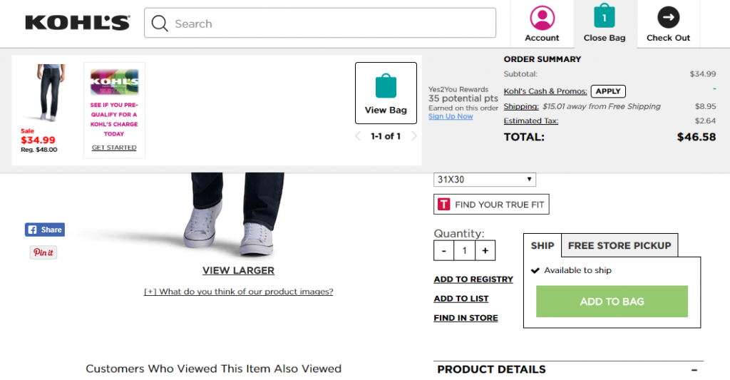
- Immediately acknowledges added items. The shopper should never be left wondering if the item was successfully added. Have a clear message pop up confirming the addition to the cart, and if you have a cart icon, make sure the number of items in the cart is always visible and updated. For instance, when you add an item to your bag at Kohl’s, the shopping bag opens from the top showing your all your items, including the newly added one on the far left.
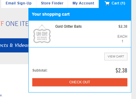
- Provide easy access to the full cart. There should be an obvious link to the full cart or checkout so that shoppers can view all the details the mini cart may lack and easily make their way to the checkout. Hobby Lobby provides a very clear button for the checkout.
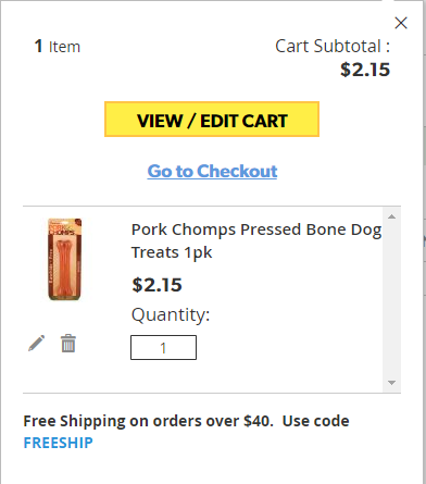
- Allow order changes. At the very least, visitors should be able to remove items from the mini cart instead of having to navigate to the full cart. Bonus points if you also allow them to change quantities as Dollar General’s mini cart does.
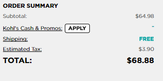
- Provide order total. Make sure they can see the order total, including tax and shipping, from the mini cart like Kohl’s has on theirs.
A properly implemented mini cart removes common shopping frustrations, provides a better user experience on your ecommerce site, and reduces cart abandonments. The end result is more checkouts, which is exactly what you want!
