

I don’t know about you, but in the past, I’ve avoided the Verizon website like the plague, or at least a zombie-inducing virus. But then a few months ago, I heard about new plans and pricing for my cell phone carrier of choice. Could it be true? Did the communications giant really, FINALLY learn how to simply and efficiently convey its pricing and plans? I psyched myself up for visit to the site.
I was shocked at what appeared to easy navigation, simplified explanations for pretty much everything and calls to action that made sense. In short, this was not the Verizon website I remembered from years past.
Have you thought about your website content lately? Even if you’re a small- or medium-sized business in comparison, you might learn a thing or two about making every word count on your website.
Home Page
The home page of the current Verizon site makes use of a minimalistic design that puts the focus on the tasks most site visitors want to complete. They’re looking for a new smartphone or other device, a data plan to go with that device, or maybe a way to save money.
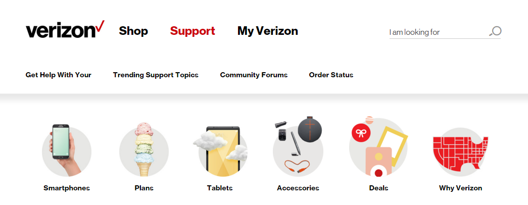
In addition to having simply labeled categories, the home page also has quick links to getting help with your device, order status and trending support topics (notice they’re not shying away from admitting that you will sometimes need to address a problem with your device).
With very few words, Verizon manages to convey pretty much every reason you might have for visiting the company’s site. Can you say the same thing about your site? Do you know your customers well enough that your website reflects what they need from your site? If your answer is, “Hmm, I really don’t know,” it’s time to consider putting some time and effort into creating buyer personas for your business. Knowing your customers and the pain points your product or service can alleviate, is half the battle to improving conversions on your site.
Plans
In the past, a cell phone plan with any carrier felt like you were signing your life away. For the next two years, you were stuck with whatever device and data plan you chose. But all that’s changing with phone subsidies going away and data becoming the main commodity most people care about. (Remember when all you cared about was unlimited texting? Ah, the good old days.)
Verizon finally got this right when it comes to how they present their “new and improved” cell phone plans: You pick your plan based on how much data you consume every month. While I’m not usually a fan of one-sentence headings, it works in the example below.
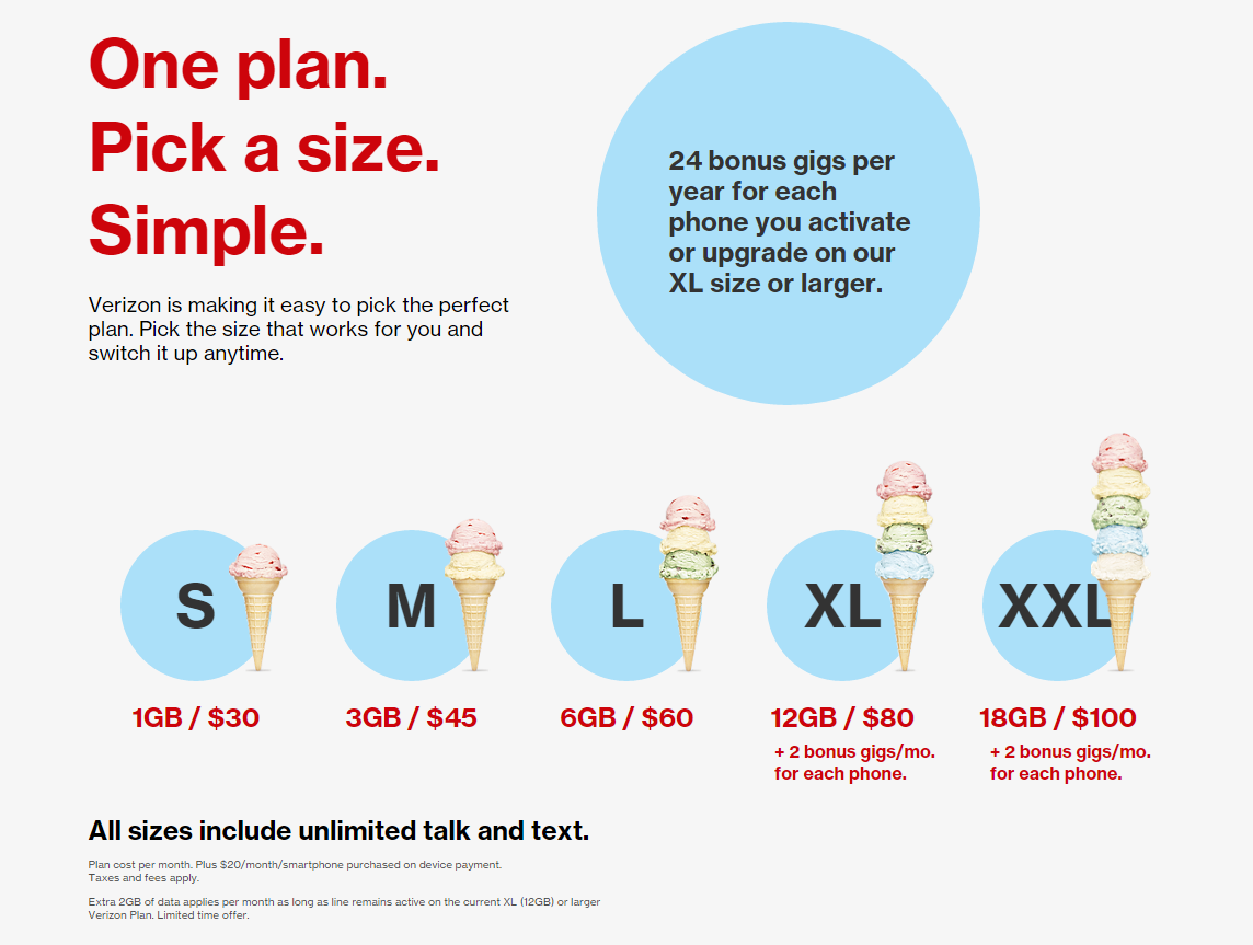
Don’t forget that images are content, too. You shouldn’t put an image on a page just for the sake of having one there. In this case, the use of scoops of ice cream is an easy way to show that the size of each data plan. (And who doesn’t like ice cream?)
A logical next question after how much does each level of data cost is, “What about talk and text?” Yep, people still use their smartphones to talk, some quite a bit, so that sentence is important to include. I’m not a fan of the “fine print” below the talk and text line, but on an otherwise clean and clear page of content, I’ll let that one slide. (And it’s probably a missive from the legal department.)
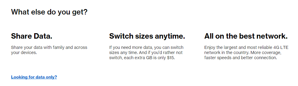
If you know your target customers, then you should already know the questions that they typically ask when it comes to your product or service. Verizon does a great job of posing the question many people ask after learning about the simplified data plans: Am I locked in? How about sharing data? They’ve rolled this into one question, “What else do you get?”
It’s important to note that not ALL the benefits of the new style of plans are listed, just the main ones. Are you guilty of saying too much on your site? Can you streamline your content to better focus on the top benefits of your product or service?
Calls to Action
Got all that? By the time I got to the bottom of the Plans page, I didn’t feel overwhelmed with information, just informed. There’s a distinct difference. Too much copy on a page invites people to skim to try to find the information they’re looking for, and when they can’t they abandon the page altogether. No conversions happening there.
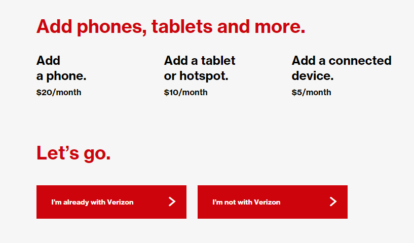
Verizon uses the last bit of content on the page to lead the visitor through the sales funnel, without it feeling too “sales-y.” You clearly see pricing for adding different kinds of devices, with a short CTA of “Let’s go.” Now you simply choose which type of buyer you are, and you’re on your way.
The Take-Away
If a big brand can use content simply and effectively, so can you. Take the time to create buyer personas to really know your customer and what they want out of your site. Use enough words to convey the benefits of your product or service, and make sure images actually support the message or concept you’re trying to convey.