Anyone who has spent time perfecting landing pages for PPC or other ads knows that it’s not just the content that determines the success or failure of the page. In fact, a good landing page has to be perfected in a lot of key areas such as content, messaging, images, colors, paragraph headings, font layout, calls to action, and overall visual appeal.
If all of these are important for a landing page, then they are important for every page!
While a dedicated ad landing page may function slightly differently than any other normal site page, overall, the goal is the same: To convert visitors into customers.
When it comes to optimization, there is no shortage of obsessing over the content. We know the topic searchers want information about and the specific keyword phrases that match the intent of what our site offers. Yet, when obsessing over the details of your optimized pages, one of the key elements rarely considered is the page’s visual appeal.
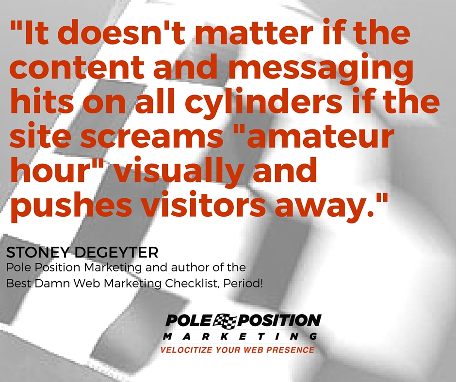
One of the first thing any visitor does when landing on your site is assess its credibility. [inlinetweet prefix=”” tweeter=””]It doesn’t matter if the content and messaging hits on all cylinders if the site screams “amateur hour” visually[/inlinetweet] and pushes visitors away.While that optimized content might do wonders at bringing visitors to the site via search, if the page itself isn’t visually appealing, you’re attracting visitors to a page with a low chance of converting.
Most web pages are developed as templates. Text goes here, images over there, and calls-to-action are everywhere. The beauty of templates is that each page is consistent with the next. But that can also be an extreme drawback for getting the message of the page across visually.
If we treat each page as a landing page, we have to be willing to break the not-so-proverbial mold provided by the template. Templates are great, but if every page looks exactly the same as the last, there is a good chance you’re missing visual opportunities to enhance each page’s message.
Sometimes you need to step outside of the template and present your content in a way best suited to the message. This might mean two images instead of one, or a call-to-action in a different place, bolder font choices, etc. Take the time to consider both the message of each page and the visual appeal needed to get that specific message across.

