
 This is part of the Total Usability Series that was originally published in 2007. A decade later, usability is more important than ever, so we are revisiting this series and updating all of the articles. This post was updated 9/21/2017.
Product pages maintain considerable strategic importance for ecommerce websites. Your visitors enter your product pages not only with an intention to buy something (the most desired end action) but to also learn, research, and compare what you have against a competitor. In addition to this, product pages also serve to help buyers find relevant pricing information, delivery costs, warranty and/or return policies, and a whole lot more.
To be effective, your website must implement product pages that are able to satisfy each of your visitor’s needs. But information isn’t enough either. While providing necessary information, these pages must be user friendly and convincing enough to entice your visitors to move through the purchase process — on your site rather than on a competitor’s website.
This is a tall order for pages that typically have very little content. But it’s not impossible. Here are 10 things that will help make your product pages more user-friendly and therefore more likely to convert.
1. Calls to action
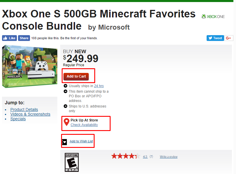
Every product page absolutely must have at least one, if not more, calls to action. The most important action a user can take is to “buy now,” but other actions such as “purchase,” “add to cart,” “save for later,” “add to wish list,” etc., can be equally effective at capturing a sale.
You can see on this product page from GameStop the “Add to Cart” CTA along with options to check availablity to pick up at a store and to add to a wish list.
2. Contact information
Not all shoppers are comfortable using web forms or wish to purchase online. Others have questions that need to be answered before completing their purchase. For these shoppers, you should have a visible phone number or email address as well as additional contact information and purchase options available. You may also want to consider providing live chat support. This eliminates the waiting that often sends customers fleeing for a competitor’s site.
3. Consistent layout
Product pages must be consistent from page to page (product to product). Don’t confuse visitors by changing the location of information from one product to the next. Keep information consistently located on all product pages.
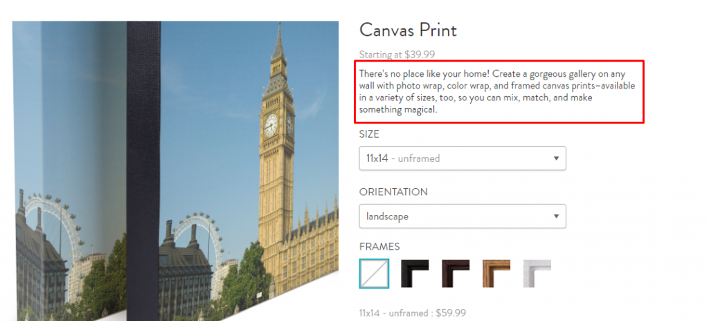
4. Overview information
Each product should contain a product summary, overview or short description. This information is best provided as high up on the page (“above the fold”) as possible. Additional information such as features, specifications, etc. should be secondary.
Snapfish keeps the overview information for its canvas print product short, sweet, and above the fold.
5. Detail information
Leave room on the page for necessary information and details. Consider a tabbed layout for this additional information so that it doesn’t become overwhelming or distrct from critical information such as price and the CTA.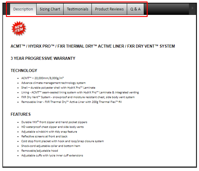
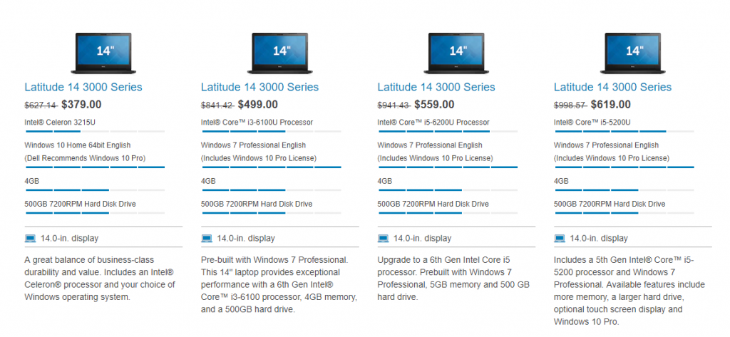
6. Product comparisons
Allowing side-by-side product comparisons can enhance the shoppers’ experience. Comparisons, like this one on Dell’s website, help shoppers find the product(s) that best fits their needs and help them make the best purchase decision.
7. Printer-friendly option
Not every shopper will be ready to buy now and may need time to mull over their purchase. Particularly in a B2B setting, they may have to get approval from someone else. Product and comparison pages should contain printer-friendly links that allow shoppers to print the information for later reference. Once printed, this also provides them a reminder of where to come back to in order to make the purchase.
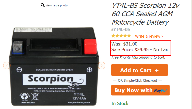
8. Pricing
Unless products are custom priced, pricing information must clearly be presented on the product page. If the product is on sale, be sure to indicate that along with the regular price so the customer can see the deal they’re getting.
If specific pricing information cannot be added to the page you should include price ranges or “starting at” pricing.
If you sell products to international destinations, include pricing information in different currencies. If you support a wide range of international destinations, provide a link to a currency conversion site allowing your shoppers to make the conversions easily on their own.
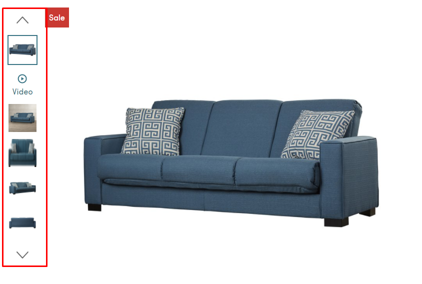
9. Images
Image quality plays a significant role in the mental process of making the decision to purchase. If customers can’t get a good idea of what a product will look like “in real life,” it’s a dealbreaker. All images should be of the highest quality possible. Poor images convey poor products.
Add additional alternate images whenever possible. Enhanced image views such as larger pictures, zoomed in and multi-angle views and even video can provide additional benefit to shoppers. This benefit enhances trust in the products shown.
This is particularly important with large purchases, such as furniture. Customers need to be able to see it from different angles and see the details to ensure it is really what they need. You’ll see that Wayfair offers several views and even a video to help customers properly envision the product.
 The role of your product page is to inform and sell. It needs to do both. The better informed shoppers are, the more likely they will be to not only purchase from you but to make the right purchase. A sale that later turns into a headache due to lack of information is a profit loss. On the other hand, giving visitors the information they need will steer them to the right product and help them make an informed purchase that creates profit not just from one sale, but from repeat purchases for years to come.
One Response to 9 Product Page Usability Factors That Shant Be Ignored