
Your homepage is like beachfront real estate. Everyone wants a piece of it! [tweet]
Admit that there’s too much there
The first step to better homepage design is admitting that not everything on it deserves to be there. The main purpose of most homepages is to be a 10,000-foot view of what a site contains, providing simple direction for how to get to the most appropriate place for each visitor’s task. It’s like looking at the map of an amusement park. Oh, you’re a family with two young kids? Well, here’s the playland and here’s the easiest way to get there. Oh, you’re just here for the huge roller coaster (like me!)? You can go this way. Basically, visitors can self-select their way toward content that meets their needs.
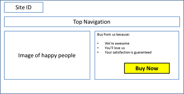
But you don’t do that do you? You stuff as many promotional elements on the page as possible to appease all of the stakeholders (you know it’s true!). Everyone thinks about what they want the visitors to do because they only care about their little piece of the pie that they’re responsible for. So, you break under the pressure and now your homepage is spraying visitors with a fire hose. Or maybe you’ve got pressure from the top to achieve more conversions. You figure you’ll just make the homepage design focus on the conversion and be done with it. Yes, some visitors will arrive on your homepage to convert, and you need to provide an easy way for them to do so, but this will be the small minority. When you design your homepage around your macro-conversion, you’re just frustrating most of your users—and yes, it does affect your conversion rate. There are way too many homepages that look like this:
Create a user-friendly map for your users
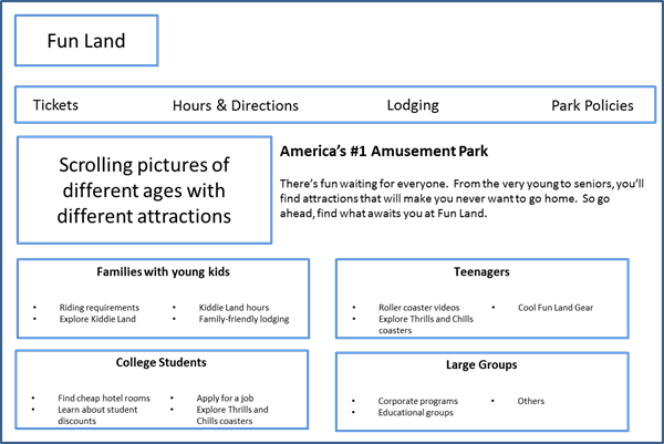
What’s that? You want to change and become a usability hero to your company? OK, then your first step is to map out the use cases of your site. This is done by mapping out the different types of visitors that come to your site along with the types of tasks they could possibly want to accomplish. For my amusement park example, it might look something like this (no, it’s not comprehensive):
- Families with young kids
- Find admission prices by age
- Learn about rides for kids and families
- Investigate riding requirements (height, weight, etc.)
- Check out specific playland hours
- Find family-friendly lodging
- Teenagers
- Learn about thrill rides
- Experience a taste of the rides online and share with friends (video, animation, etc.)
- College Students
- Learn about thrill rides
- Apply for a job
- Find cheap hotel rooms
- Learn about student discounts
- Large Groups
- Group prices and discounts
- Seniors
- Senior Prices
- Learn about live shows, gift shops and other activities
- All Visitors
- Hours & Directions
- Ticket Prices/Buy Tickets/Buy Season Pass
- Find Lodging
- Park policies on what you can bring in/storage of personal items/dress code, etc.
Once you’ve finished this activity, you’re going to have a good view of how each type of visitor thinks about using your site. Your job is to group and arrange the content of your homepage in ways that make it as easy as possible for each type of visitor to accomplish the specific task(s) they came to the site for. So, your homepage design should look more like this…
Let your users make your map easier to use
But be warned! Don’t just come up with one idea and implement it. The reason it’s a mistake is because it’s your idea of what you think will be easy, not what is actually truly easy for each visitor. Do you see the difference? I hope so. Here’s where you’ve got to get your hands dirty and actually interact with real people who use your site. Word on the street is, you’ll be very surprised at how hard many visitors perceive tasks to be that you think are quite easy the way you’ve laid them out. These insights will really go far toward creating the best possible homepage for your users.