 This is part of the Total Usability Series that was originally published in 2007. A decade later, usability is more important than ever, so we are revisiting this series and updating all of the articles. This post was updated 10/5/2017.
Forms are one of your primary points of contact with your visitors. While many visitors still use email or even the telephone to contact you or to place an order, the vast majority will contact you first via your web forms. Forms that are broken or over complicated cause frustration and can greatly reduce your conversion rate for leads and sales.
It’s up to your design and development team to test your site’s web forms thoroughly to ensure they work properly and are easy to use. While no site can be perfect, finding and fixing issues sooner, rather than later is important to maintaining a usable website.
Implementing these tips for creating usable forms will help ensure visitor satisfaction, reduce exit rates, and increase conversions.
First Impressions
When a visitor sees a form, they see two things:
- Time. Time is one of our most valuable commodities. Visitors will immediately ask themselves if the form is going to take a long time to complete and if it will be worth it.
- Risk. Providing information online is a risky proposition. They will wonder how you will use their information and if completing this form will subject them to an onslaught of spam, unwanted phone calls, etc.
Dispell these fears by:
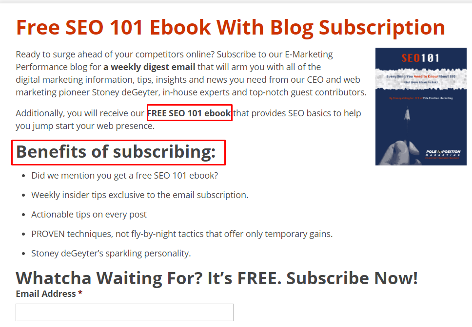
- Clearly identifying the form and its purpose. Make sure the form has a clear title and an explanation of exactly what they will get and what will happen if they complete the form.

- Requiring as little information as possible. Do you really need someone’s phone number and address to deliver an ebook? Nope. So don’t ask for it. The more fields there are, the more likely the visitor will bail.
- Providing privacy assurances. Assure them that you will not share their information and let them know exactly how you will use it.
Make It Easy
The more complicated and frustrating a form is, the more likely it is that the visitor will fail to complete it, no matter how much they want what you offer.
To avoid frustration, you first and foremost want to make sure your form works properly. Test it thoroughly and correct any issues before visitors use it.
But just because your form technically “works” doesn’t make it user friendly. Including the following elements will help ensure that it is:
Take the Sting Out of Errors
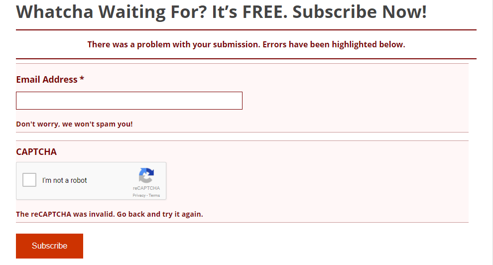
Entry errors will happen, no matter how user friendly your forms are. What matters, though, is how your site handles them. Make sure that when there are errors, your forms:

Finish Strong
You finally got the submission, but now is not the time to rest on your laurels! The end of every conversion is the opportunity to encourage the next conversion, so make sure your site leaves a positive parting impression.
After a form has been completed and submitted, provide all submitted information for final review and verification. Take the visitor to a confirmation page that thanks them for their submission and explains what will happen next. Provide as much detail, including time frames, as possible.
Let’s face it, no one is dying to complete a form. By making your forms as user friendly and easy as possible, you can encourage people to take the time to follow through with the conversion and forge a long-lasting relationship with your company.

 “The more complicated and frustrating a form is, the more likely it is that the visitor will fail to complete it, no matter how much they want what you offer.” — Stoney deGeyter