 If all our clients considered conversions to be as important as top search engine rankings, I think I would pass out. Or pass the beers! Unfortunately, conversion optimization takes a back seat to the age-old question, “Where are my rankings?” What businesses should be asking is, “Where are my conversions?” To paraphrase James 2:20, “But do you want to know, O foolish man, that rankings without conversions are dead?”
True conversion optimization takes time and testing. What works for one site may or may not work for yours. You only know by trying it out and looking at the data. However, there are some good old standbys that are generally recognized as universal. If you don’t know where to start on conversion optimization, here are a few quick and easy tips.
Make your phone number visible
I know, I know… You don’t want to handle customer calls all day, especially with issues that can easily be resolved on the website. I get it. We all feel that way! Unfortunately, there are still a lot of Web users who prefer traditional forms of communication – like the phone.
If your phone number isn’t prominently displayed on your site, you are potentially losing these customers. Most visitors won’t call, but the confidence a prominently displayed phone number provides can be immeasurable. It’s the security in knowing you can call and get immediate help, rather than waiting 24 hours (or more) for someone to return an email. Simple assurances such as this can have a huge impact.
Answer emails and phone calls
I am surprised by how often prospective clients tell me that our company was the only one who followed up with them on their SEO inquiries. As a business owner, this is something I never understood, yet too many companies still let their phone calls go to voice mail or don’t return email messages in a timely manner.
Customers are turned off by answering machines and unanswered emails. This is a very quick way to create either a negative or positive first impression, and you only get one chance at it! Quick responses are the epitome of great customer service. If a company isn’t willing, or able, to return my call before I’m a customer, they certainly won’t be likely to do it once they have my money!
Fix typos and grammatical errors
Nothing says “amateur” more than spelling and grammar errors. Your website content is a representation of who you are. It speaks directly to your professionalism. If your site is littered with typos, potential customers may lose confidence. I know, silly, right? But you feel the same way about other websites, so no judging!
It’s those small things that often make or break a sale. ‘No cents leaving it to chanse!’
Show prices and shipping info
I can’t stand sites that bury their pricing information. While price isn’t the only factor shoppers use to make a decision to purchase, it is a significant one. If your visitors are unable to find product or service prices, they’ll likely move on to another site that will display them.
While most sites readily display pricing info, many continue to bury the shipping costs. I’ve left a number of sites because I had to get too far through the checkout process just to figure out how much it would cost to ship my order. When sites do that, I usually know I’m in for a shipping surprise!
Whenever possible, make your pricing and shipping costs easy to find and/or calculate. Don’t force visitors to wait until the end of the check-out process to get an order total!
Create an ‘About Us’ page
Not only do you need an About Us page, but you also need to fill it with great information about your company. This is one of the pages many shoppers go to when they want to do business with you but need to feel a bit more secure about whether they can trust you or not. Your About Us page can give visitors that needed security.
Fill your About Us page with company history, team leader bios, company skills and experience, mission statements, etc. All of this information can play a role in building confidence that helps your shoppers choose you over a competitor. A great About Us page creates a personal touch and lets visitors see the faces behind the screen.
Underline your links
There are many ways to make your links stand out. You can bold, italicize, change color, highlight, etc. But there is one thing that stands out like no other, and that is underlining your links. Link text that isn’t underlined is often mistaken for just more bold, italized, colored or highlighted text. Unless shoppers frequently visit your site, anything other than underlined links may be lost on them.
Underlined text on a web page is the universal sign of a hyperlink to another page or area of the site. While we all want to build unique websites that stand out, there are some universal expectations that you have to meet to avoid confusing your visitors. Yes, your site does need to conform to (some) typical Web development practices. Otherwise, you lose your ability to communicate effectively with your audience.
Underlined links create clarity for your visitors, making navigating from page to page easier. If it’s underlined, they know it’s a link. No question.
Create a custom 404 error page
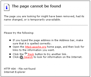
Have you ever clicked on a link and the resulting page looked something like this?
Pages like that don’t give you many options. And none of them help you navigate the site you thought you were clicking on. If you’re offering these types of pages to your visitors when they inadvertently click on a broken link, then you’re likely losing those visitors. By creating a custom 404 page not found page, you give your visitors the opportunity to stay on your site to find what they were looking for.
Broken links happen all the time, especially coming from external sites that you have no control over. By creating a custom 404 error page, even a broken link to your site is a potential sale opportunity.
Add links in your body content
The simple rule of thumb here is not to make your site navigation do all the work. Links in content are just as – if not more – important than your site navigation. Good navigation is essential, but when visitors are engaged in your content, you don’t want to force them to disengage to get to the next page.
Links in your content not only help each visitor decide where they want to go next, it gives them multiple options based on the content of your content. If you are talking about your team, link to your About Us page. If you are talking about your successes, link to your testimonials. If you are talking about your services or specific products, link to them, as well.
Whenever a visitor reaches the end of a page without any content links, they are forced to think about what information they want next. This gives them an opportunity to leave your site. Using content links keeps them engaged and on your site, hopefully until they get enough information to convert.
Fix broken links
While the 404 error page noted above is great for keeping people on your site when they encounter a bad link, it’s still better to eliminate as many broken links as possible. You may not have control over external links to your site, but you do have control over internal links on your site and even external links to other sites.
Broken links happen. Sometimes content gets moved or removed and not every page is updated as it should be. Sometimes sites you’re linking to do the same. The more you link, the more opportunities there are for links to go bad. Check all your site links regularly to make sure no new broken links turn up. Fix those you can and remove those you can’t.
Calls to action
Every page on your site needs to have at least one call to action. A call to action is simply a line of text or an image that tells the visitors what they should do next and links them to that opportunity. A call to action can be almost anything, but here are some typical ones you can use to get your visitors to take a desired action:
- Continue reading
- Add to cart
- Buy Now
- View testimonials
- Check out our services
- Call us
- Email us
- Follow us
- Sign up
- Download
You get the idea. Calls to action drive the visitor from page to page or from page to purchase. It may seem silly, but your visitors want to be told what to do. The call to action does that. It’s still their choice, but at least you’re providing them with one.
I guarantee that most, if not all, of the tips above will bring measurable improvement to your site conversion rates. But hey, don’t take my word for it. Test it out and see for yourself. If I’m wrong, at least you know you’re not missing any conversion opportunities. If I’m right, send a card. Or better yet… a link!
Follow me+ at @StoneyD and @PolePositionMkg.


One Response to 10 Easy-Peasy Conversion Optimization Tips That Make Visitors Happy