Sometime amidst all the content about “how to do x” and “x steps to world domination,” it helps to just take a tour through something. It helps to take a real-life living, breathing (OK, websites don’t breathe, but you get it) example and dive deep into it. Examine it. Poke and prod it. That’s what I’m going to do here.
Instead of talking theory about how to have a better website, we’re going to tour one together. In the midst of all the data there is to analyze, sometimes you can learn the most just by going and using a site. Click things. Download things. Search for things. Usually, you find enough issues to keep your team busy for a while. You should also come away with questions about many things that can lead to testing.
For this tour, our team randomly chose a big brand they were interested in and told me to lead you on a tour of it. They chose IKEA. If you’re unfamiliar with this brand, they are a multinational group of companies that designs and sells ready-to-assemble furniture (such as beds, chairs and desks), appliances, small motor vehicles and home accessories. Most of the women I know love it. Here’s the United States version of their website, which is what I focused on.
Here we go!
Navigation
For the most part, the architecture of the content and the labeling of the navigation is pretty much what one would expect from a furniture/home goods business. The majority of the issues I see here have to do with layout and design.
Layout
The typical expectation of a user is that the most popular items would be to the left (since we read left to right). Since this is the case, it seems like “Offers” and “New” are out of place here. The only exception I can see here is if those are two of the top reasons people come to the site. Then, I might make an exception. I’d probably start the navigation with “Living Room” and move the other two options to the right of the main categories.
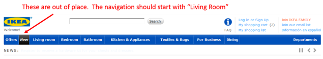
But, I’d use analytics data to determine which categories users were most interested in. You could use metrics like number of pageviews for each category (/categories/departments/living_room/) or a tool like In-Page Analytics to show where most people click from the Homepage.
Also, it’s important to the user experience for elements that are like each other to be designed similarly and for elements that are different to be designed differently. In this navigation, the “Offers” option is designed the exact same way as the rest of the categories. It’s got a blue background with white text and the same font. Aesthetically, this makes it seem like a product category even though it’s not. Changing this up would help users distinguish between the two and likely lead to more action on people looking at special offers.
Lastly, notice how the “Departments” option is off to the right all by its lonesome.
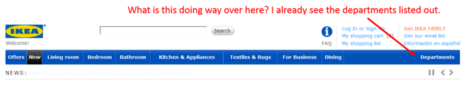
Aren’t “Living Room, Bedroom, etc.” departments? Why are you double-serving me departments? My inclination is they did this because they couldn’t fit all their departments in the top navigation. Therefore, they chose the most popular ones to put in the top navigation and then created a master drop-down list off to the right.
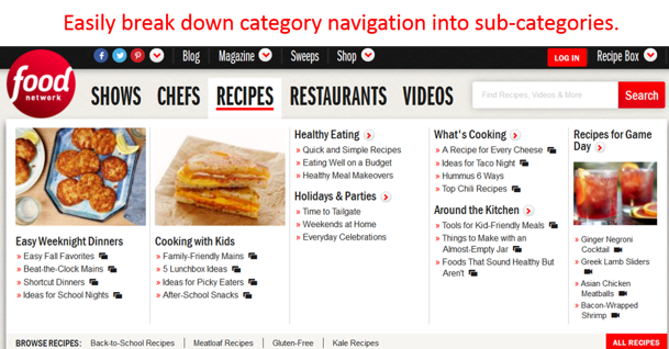
This could easily be solved with drop-down mega-menus for each category like this:
Design
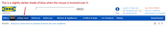
When it comes to the design, there are a few major issues I noticed. First, the design is inconsistent. When I hover my mouse over a department heading, the blue turns to a slightly darker shade of blue. I can click on it to go to the living room department.
But then when I hover my mouse of the actual “Departments” heading, I get a drop-down menu.
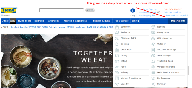
Things that are designed the same should also function the same. There is no indication on the “Departments” heading that hovering over it will drop down more options (like an arrow).
Second, one of the main functions navigation needs to provide users is orienting themselves with where they’re located within the site at any point in time. This is typically done by dynamically changing the design of the categories that are chosen. As we saw above, if I choose the category “Living Room,” the blue changes to a darker shade of blue. That’s just not enough of an indication to make it clear where I am (especially if I landed on this page from off the site). As Steve Krug says in his book Don’t Make Me Think:
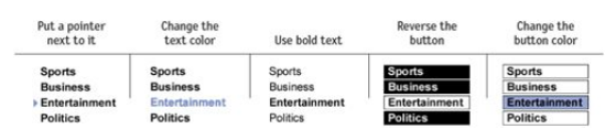
The most common failing of “You are here” indicators is that they’re too subtle. They need to stand out. If they don’t, they lose their value as visual cues and end up just adding more noise to the page. One way to ensure that they stand out is to apply more than one visual distinction — for instance, a different color AND bold text.
Here’s an image from the book that shows the common distinctions that can be used:
Last, after I navigate to a sub-category page (Living Room), let’s take a look at the subcategory design under the top navigation. Although they use visual separators, the left-to-right design right underneath the primary navigation’s left-to-right design makes it look too much like paragraph text. This is likely to get lost as the user scans the page and creates cognitive dissonance in their mind when they try and consume it.
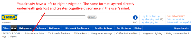
To be able to clearly distinguish the options, I think users are going to have to read it carefully. But we all know users don’t read online. So I think most of them are jumping right down to the images and scrolling to try and find what they’re looking for in the category.
Homepage
Content
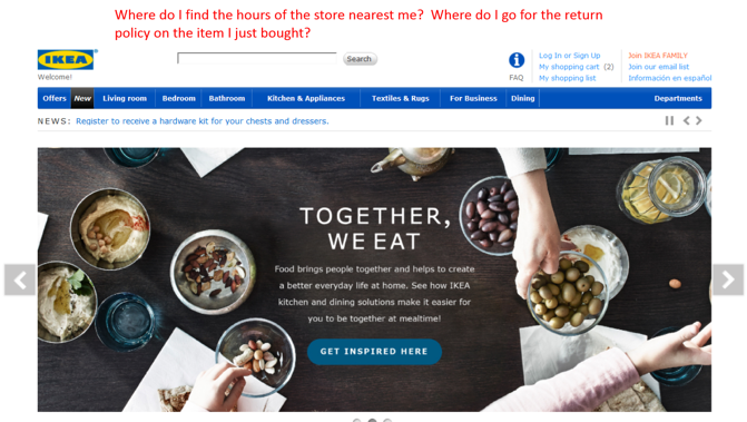
The #1 thing I believe the guardians of this homepage have to learn about what users like to do on homepages is this — they like to get off of it as soon as possible. When a user comes to a site, they’re not really interested in what you want to tell or show them. They’re interested in accomplishing the task they came to the site to accomplish — like finding the hours of the store nearest them, finding the perfect couch for their new living room, reviewing the return policy of the product they bought last week that isn’t working out quite right for them, etc.
This page is full of “look at what we want you to see’s.” Whether it be current sales, news or whatever, the prime real estate of the page isn’t helping users accomplish their tasks first and foremost by directing them to where they want to go.
Layout
Honestly, I hate homepage carousels (see above). To me, there’s nothing that says “this site is about us, not about you” more than the homepage carousel. It dominates the beach front real estate of the site with things that may or may not (more likely not) be important to the searcher. Most of the user tests I’ve observed consist of them being ignored while they push content that users are looking for out of the way. I believe this site should re-think how they can use that space to better serve their users.
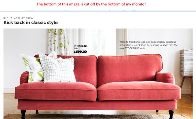
Another issue I see here is the relationship between location and importance of elements on the page. For example, I would think that for a big brand retail chain with lots of brick and mortar locations that people like to travel to, one of the most important tasks users are looking to accomplish on their site is finding the scoop on what’s available and going on at specific locations. If this is true, then why do users have to scroll 4 monitor lengths down the page before seeing a way to navigate to a specific store location site?
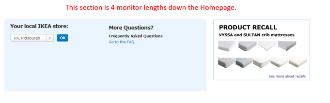
Surely that should be above the fold.
Also, if there’s a recall on your products, that’s kind of important for your customers to know right? So tell me how they’re going to know when the notification is also 4 monitor lengths down the page? They’re not.
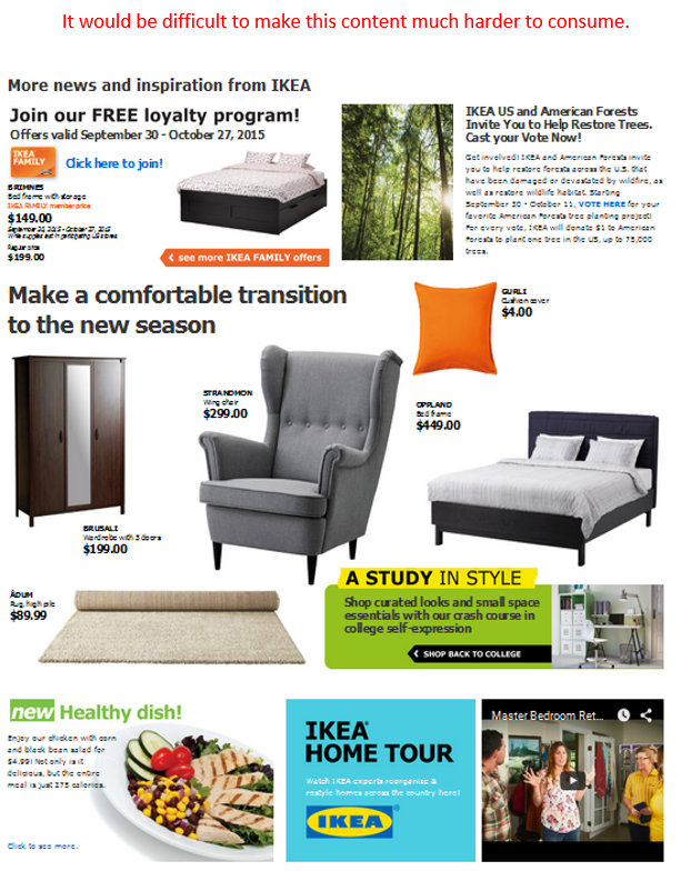
Finally, the way a site uses space is ultra-important to helping users scan its contents and clearly consume everything there is to see. I’m not going to say much here. I think this picture says everything . . .
Design
Looking purely at the aesthetics of the site, if I wasn’t already familiar with this brand, I would think it was probably a local, family-owned business. They clearly haven’t invested much in terms of time, money and energy into it relative to the size of their business. Now, there may be perfectly good business reasons for this. I’m just stating my perception.
A couple things I’ll point out here. . .
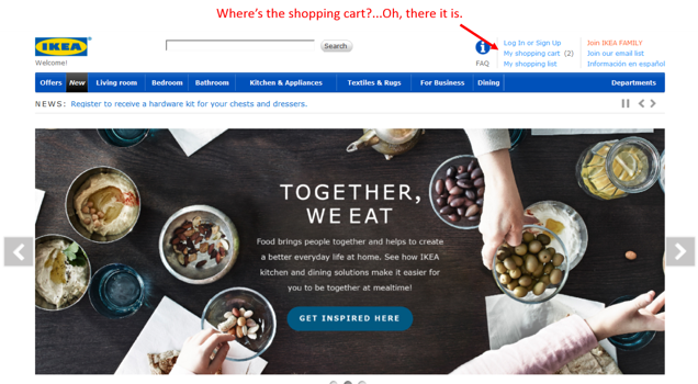
Notice how the size of the headline text is smaller than the size of the text in the content beneath it? The headline doesn’t correctly frame the content it’s referencing and creates confusion for users.
Also, when users go to view their shopping cart these days, they’re looking for an icon. While we’d have to watch users in action to confirm it’s the case, I would put money on them not having the easiest time finding how to get to their shopping cart.
Category Pages
Layout
Here we find that pesky left-to-right navigation design again that makes users read. Some navigation options even have text that wraps from one line to the next.
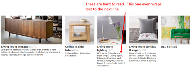
This would be much more readable if it was in some sort of bullet-point format.
Design
Again we find tiny headlines.
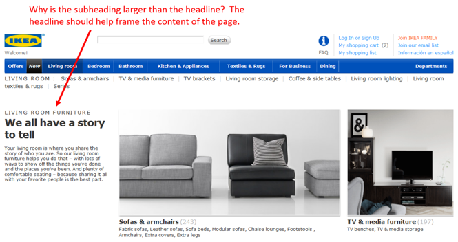
The headline is one of those things that has a big impact on how a user views and interacts with each page. Especially if a users lands on the page from offsite, the headline has a big role in communicating to the user where they are and what’s on the page. They should make it bigger.
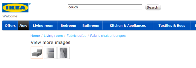
Speaking of bigger, some of the images are much bigger than they need to be. Yeah, I get that the images on this site are important because of what they sell. But there are some images that don’t even fit on my screen. While users appreciate being able to see the detail, this is overkill. If they want to zoom in on images, give them a zoom feature on the product pages. I shouldn’t have to scroll on my desktop monitor to be able to consume a whole image.
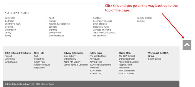
Finally, let’s talk about something I love for once. As you scroll down the category pages, check out the up arrow on the right. You click it, and it jumps you back up to the top of the page instead of having to scroll up with your mouse or go grab the scroll bar. That saves me work. Love it!
Subcategory Pages
Filtering
One thing that sticks out to me about the product filter functionality is that they make you enter your price range into boxes.
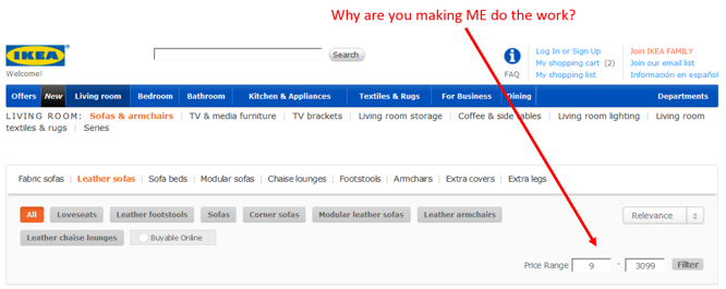
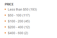
From their side, they might be thinking this gives the user ultimate control over the products they see by the exact prices they’re willing to pay. The problem is the extra work it creates and the problems it can create. Because there are no price filter suggestions with the number of products in each price range, I basically have to do guesswork. I have to guess what price range I am safe with to get a decent amount of results. If I get no results, I have to guess again . . . and again . . . and again . . . until I’m satisfied. All that work could be done away with if you just tell me how best the price ranges are broken down and how many products are in each range like this…
Also, I went to use the color option to filter and the products didn’t match the color…
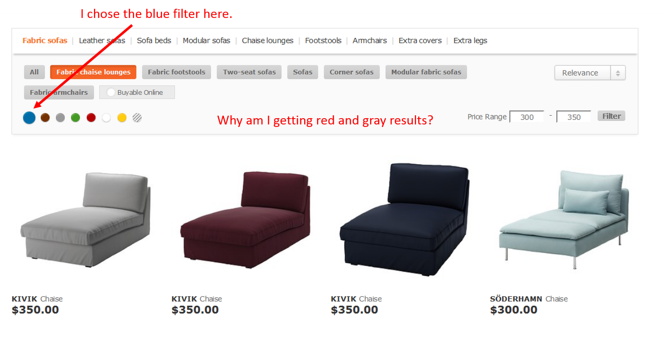
Sorting
It’s great that they have a sorting feature (in the image above), I just question its location in the filtering box. Filtering and sorting are different. I don’t want my users thinking that the sorting drop-down is actually going to filter instead of sort. Also, I definitely want to see “Sort by” next to the drop-down box. I don’t want to assume the users know what it’s for.
Product Listings
Each product listing has name and price . . . and nothing else.
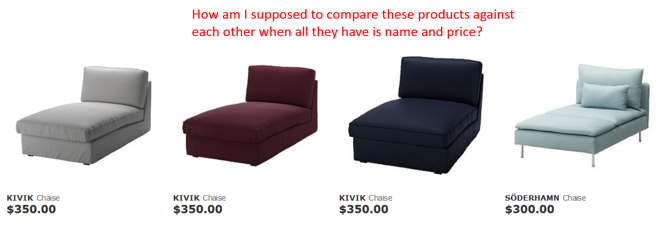
How am I supposed to compare the listings against each other and decide which one to view more details about?
Product Pages
Here’s where I take a break from criticism and move over to praise. They did a nice job with these pages. They’ve got great images with multiple views and colors to choose from. You can even zoom in on products. Users like that when there’s detail to what they’re buying (which is the case with home goods). You can check your local store to see if they have it if you’d rather go try it out. You can save the item to a “wishlist” or add it to your cart. They’ve got pretty much everything that’s standard on a good product page.
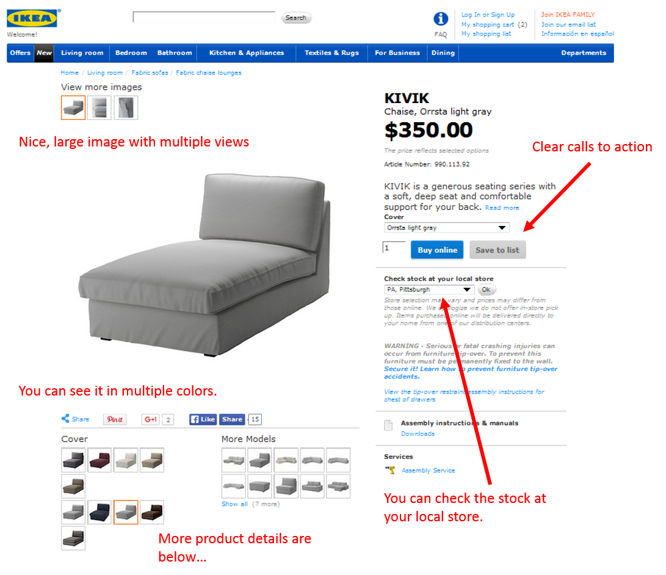
My only beef here is the names of the buttons. “Add to cart” and “Wishlist” are known and loved by millions. Why change them? Why say “Buy online” when the button is adding the item to their cart? They’re not actually buying by clicking that button. So don’t tell them they are.
Site Search
Search Functionality
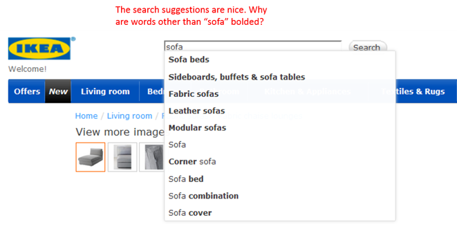
To test out their site search, I started by typing in the query “sofa.” The first thing that happens is I’m given search suggestions. This has become standard and is a nice touch. What’s interesting here is how words other than the query I entered are bolded in the suggestions. What are the parameters that determine the words that are formatted bold? It’s hard to tell here:
What if I use a synonym like “couch?”
No suggestions? Why not? Does the engine not recognize the word “couch?”
Results & Filtering
Actually, entering “couch” and hitting enter gave me sofas. Phew. But I’m still wondering why I wasn’t given any search suggestions for couch.
My results look relevant, but there are 13 pages of them, so the filtering functionality is much appreciated. I can filter by color and price, but that’s it. Why not size/dimensions? It seems like that would be a pretty important one for a user looking for a sofa. Also, why is there category and department navigation in the filtering area? That’s confusing. Functionality and space need to have a relationship. Putting two different functions in the same space is a no-no.

I love that I can compare products. For a site that has so many options, even after I narrow the products down to a few, I’m going to want to compare them to see the differences. Also, there’s a “Slideshow” feature that opens a pop-up where you can scroll through all of your filtered results. This seems like a good feature for those that like to browse. Again, these are products where users like to get closer looks. This tool helps them do that.
Shopping Cart/Checkout
Shopping Cart
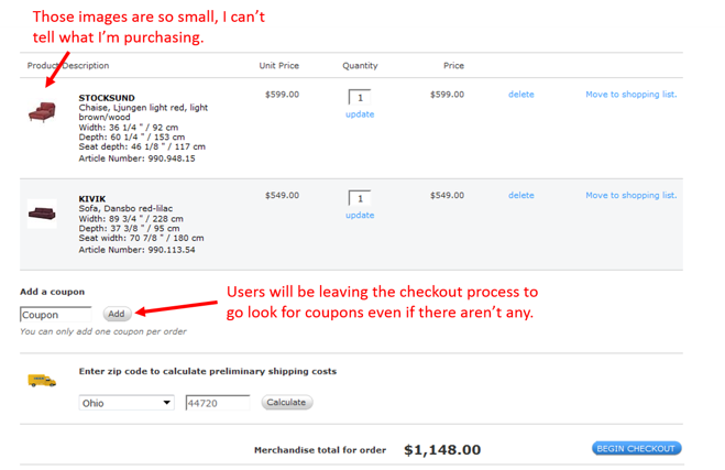
The first thing I notice when I enter my shopping cart is how small the product images are compared to everything else (see below). On the category pages, they were too big. Now they’re too small! With products that are very visual, users want to be able to see what they’re buying. Since they like to use shopping carts as holding areas for products they’re interested in, they like to go in and analyze what’s there and reevaluate what they want to purchase, how much they want to spend, etc. Small images make it hard for users to be reminded of what’s there and compare the products, especially if they leave the site and come back at a later time. I would recommend these images be increased in size.
Another change this page could use is changing the “Add Coupon” field. When users see that there may be coupons available for their purchase, they tend to leave the site on a hunt for them, essentially allowing them to put their money back in their walletS right at the time they’re considering purchasing. Lots of things can come up after they leave that result in them not completing their purchase. And if they don’t find a coupon code for their purchase? They may be disappointed. They may think about waiting until they are sent one. So, let’s name it something like “Transaction code” that doesn’t encourage users to go looking elsewhere or wait.
Finally, user anxiety is the highest when they’re thinking about checking out. It makes a difference if the site helps them feel secure. This site has no indication that it’s a secure site. Plus, given the fact that the overall aesthetic design seems weak for the size of the brand, there’s a good chance users will feel some distrust with their purchasing online. My guess is this causes some users to be wary of purchasing online. They may just go to the store if they’re really interested in the product.
Checkout
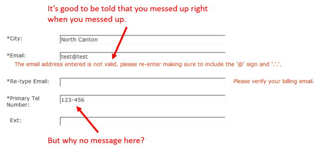
One nice thing about the checkout forms is the inline validation. I entered an email address in the incorrect format on purpose, and the form didn’t wait until I submitted it to go back and tell me where I was wrong. It can be annoying to have to go back and fill out an empty or incorrectly formatted space after hitting the button to move on to the next step. But, I’m wondering why the same functionality wasn’t present when I entered an incorrect phone number format.
Another thing they do a nice job of is laying out important information about the order and the delivery. I’ve been on some sites where you don’t know where the products are coming from, an estimated delivery date, etc. Users want to know what’s going to happen with the products they’re purchasing. This site does a nice job of telling me all the details about delivery and even lets me choose my delivery date and time right on the site.
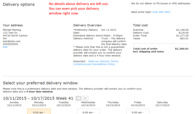
Finally, I like that they have support options on the payment page (above). Again, anxiety for the user is very high right now. If they have questions or concerns about their order, having support options there can motivate them to ask someone. I would recommend they also have a phone number to call along with the live chat though. You want as many options as possible.
There we have it. We’ve pretty much worked through all the major parts of the site and highlighted the good, the bad and the ugly. Hopefully, you’ve learned something you can apply to your site so you can better service your users and improve your bottom line.