
When it comes to ecommerce sites, the visitor reigns supreme. Which means that you have to design your website with your visitors first and foremost on your mind.
It’s not enough to have great products and great optimization. You also have to have a great on-site experience. Anything less is a waste of both your products and the time spent optimizing.
Here are eight ways you should be optimizing your ecommerce site to provide a great on-site experience for your visitors.
1. Keep a Consistent Layout
The layout of your product pages should be relatively consistent across the board. Occasionally, you have a group of products that requires unique information for which you need to create a new template. But as best as possible, keep all product pages looking the same. This allows shoppers to become familiar with a single layout so they can easily breeze from product to product gathering needed information.
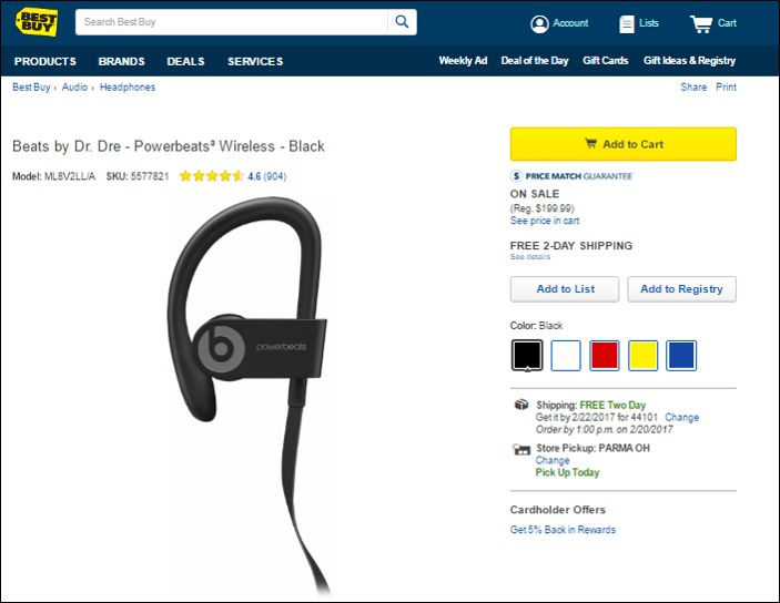
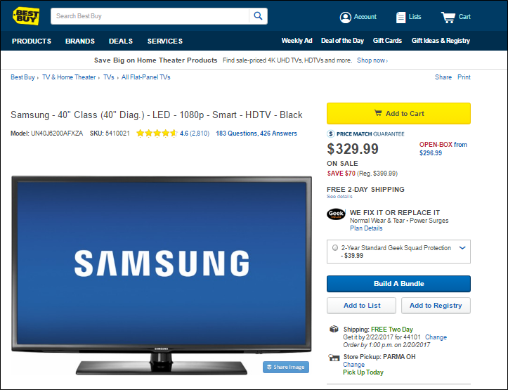
Best Buy does a pretty good job of this. As you can see, with two radically different products (a TV and headphones), the elements are in the same place, although it looks like there are some additional options with the television. One thing that could help with the consistency, though, is if the price was the same size on both.
2. Provide Multiple Image Views
Many product images can be enhanced by providing multiple views of the product. Of course, this isn’t necessary for all products, but if you have something in which a different angle view helps the visitor get a better feel for it, then this will improve the shopping experience. Either the visitor will be more apt to buy the product because they have a more complete visual, or it will reduce product returns from someone buying something that wasn’t what they wanted. Either way, you win.
Again, we look at the headphones from Best Buy. You can see them from multiple angles and can zoom in on each.

3. Announce Product Availability
Nobody wants to add a product to their cart only to find out later they can’t get it. Provide some kind of indicator as to whether the product is or is not currently available.
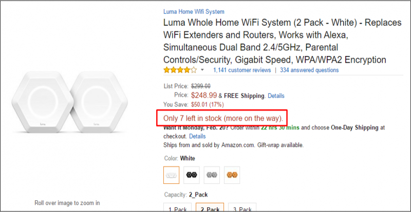
If stock is limited, displaying the number of items remaining can be a good motivator to purchase sooner rather than later. You see this a lot on Amazon. If the stock is low, you’ll often see an indication of exactly how many are left in the product listing.
4. Add to Cart Proximity
Keep your “Add to Cart” buttons in close proximity to the product information. You’ll want to check different screen sizes and resolutions on this as these variables can move information and buttons to places you would not have imagined. Considering all variables, making sure that the correlation between product and button is clear.
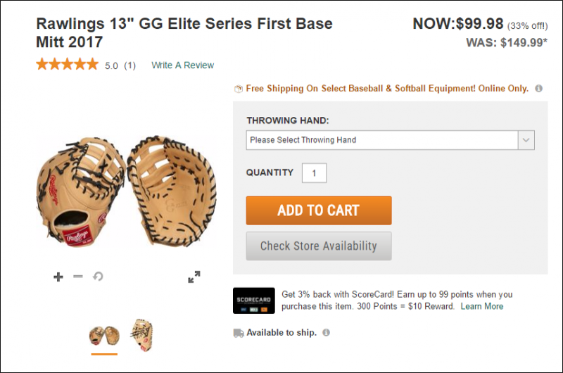
The “Add to Cart” button for Dick’s Sporting Goods button is not only near the products, but it is clear, large, and in a noticeable color.
You also might want to have an option to add the product to a wish list or save it for later viewing. If the shopper isn’t ready to buy, this can be a nice reminder the next time they log in. Similarly, provide an option that allows the visitor to forward the URL to themselves or a friend for later viewing, perhaps on a different device.
5. List Security Assurances
Every shopper–especially when on your site for the first time–has a trust hurdle to overcome. If they can’t overcome those hurdles, the chances of you getting a sale are pretty slim. Your job is to alleviate their concerns in as many ways as possible to the point where they no longer have reasons to say no.
Here are some trust issues that you need to overcome:
- Do you take credit cards?
- Do you take my preferred form of payment?
- Will my personal information be protected?
- What is your return policy?
- Do you offer any guarantees?
- If I have a problem, will I be able to reach a real person?
- Will my personal information be secure?
- Will my information be used to spam me?
You’ll see two of these concerns addressed on the product page for this North Face jacket: A Lifetime Guarantee statement and a blurb on the free return policy. These are displayed prominently near the “Add to Cart” button.
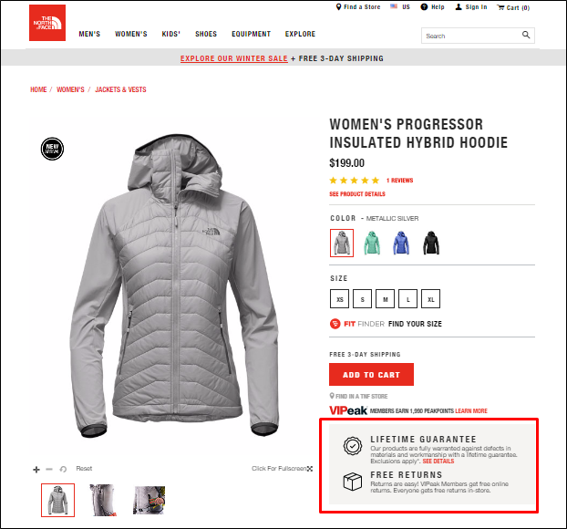
Addressing each of these issues will remove the hurdles that get in the way of the purchase. Once these are eliminated, the decision whether or not to do business with you becomes much easier.
6. Engage in Cross Promotion
Cross promoting products is a great way to increase the average order size. Most shoppers come for what they want, but if they see something else of value during that interaction, they just might add more products to their cart.
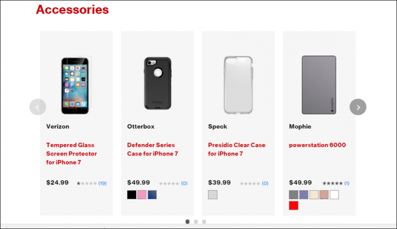
Verizon has this down pat. They know when someone buys a smartphone, they will likely want a case, tempered glass, and other accessories. Therefore, their smartphone product pages have a dedicated “Accessories” section.
7. Keep the Shopper Shopping
Imagine with me for a second that you’re in a grocery store. But the store doesn’t allow you to keep your cart with you as you browse the aisles. Instead, you have to leave the cart at the end of each aisle as you go down and browse the products on the shelves. Every time you grab an item to put in your cart, you have to walk back to your cart at the end of the aisle. And to top it off, you can only add one product at a time.
If any store did that, you probably wouldn’t return, no matter what kind of great deals they offer. But this is exactly what websites do when they force visitors into the cart page every time they add an item. That forces them out of the aisle and back to a cart somewhere completely different from where they want to be.
When products are added to the cart, provide a notification that it’s added, but let the visitor stay exactly where they are to continue shopping. When they are ready to look at the cart, they will. Otherwise, let them shop!
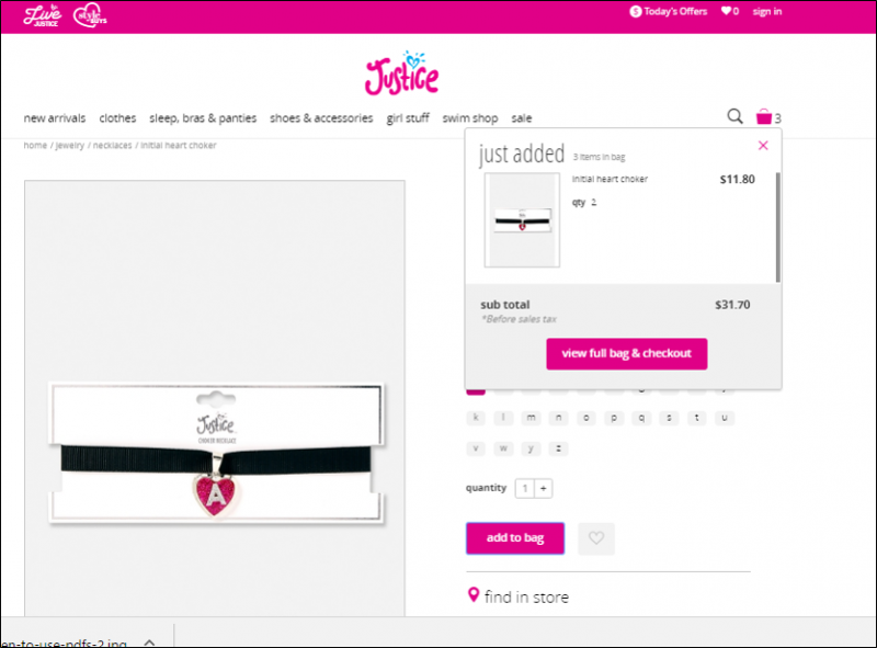
Justice, a store for girls apparel, does this well, showing a pop-up verification when each item has been added. Their shopping bag icon at the top of every page also allows you to see what you have in your bag so far by just mousing over. You never have to leave the page you are on.
8. Facilitate Socialization
In the age of social media, shoppers are more likely to share a product to their favorite social platform than they are to leave a review. In fact, they’ll often post a mini review on their streams so long as you make it easy to do so.
Providing socialization buttons gives another way for visitors to interact with your brand and become evangelists for your products.
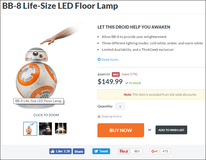
Just in case you want to show the world that super awesome BB-8 light you found at ThinkGeek, they offer plenty of networks you can socialize it on.
You also might want to make it easier for your customers to get updates about new products and sales. You can easily facilitate this by adding a Twitter or RSS feed that regularly pushes out new content and items that have just gone on sale. You might be surprised to find that these feeds may become more popular than your regular social channels!
Just a Starting Point…
Your visitors come first. Implementing the eight points outlined above will give you a good foundation for building a user-focused website. But these are just a starting point. Once these are implemented, that’s no time to rest. Use your momentum to keep finding new ways to delight your visitors.

 “It’s not enough to have great products and great optimization. You also have to have a great on-site experience. Anything less is a waste of both your products and the time spent optimizing.” — Stoney deGeyter
4 Responses to 8 User-Focused Optimizations for Ecommerce Websites