

If someone landed on your website and the only thing they could see was the navigation–and they couldn’t click or mouse over anything–would they know what you do, offer, provide, or sell?
If the answer is no, then you’re doing your navigation all wrong.
When someone lands on your site, they should immediately be able to know what you do. And the navigation is one of your best tells.
Take a look at the following navigations. Can you tell what these sites do? The answers are below, but don’t cheat.
Navigation 1:
![]()
Navigation 2:

Navigation 3:
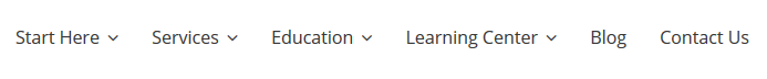
Answers:
- Sells batteries
- Sells kids clothing
- Sells digital marketing services
How’d you do?
Okay, now let’s look at a few more:
Navigation 4:

Navigation 5:
![]()
Navigation 6:
![]()
Answers:
- Sells batteries, battery chargers, and lights
- Sells clothing
- Sells digital marketing services
Now, that’s not to say that when landing on any pages in the first group you wouldn’t know what the company does, but it does require for your eyes to seek something beyond the navigation.
However, in the second group, if your eyes were drawn to the navigation, you would immediately know what they do. You don’t have to read a logo, a tagline, or a single piece of content on the page because the navigation tells the whole (or a good chunk of) the story.
And that’s a big win!
Make your navigation visitor focused
When performing keyword research, take a look at all your core terms/topics and determine which of those represent your core offerings. This should give you a list of mostly unique phrases, each deserving its own landing page.
Depending on your industry and what you offer, you might find a few relevant phrases for your navigation categories, or you might have a dozen or more. If you have only a few, use each one as a primary navigation option. If you have a lot, then figure out how to reduce them into no more than 5-7 categories.
You also need to consider the various ways in which people search. For a clothing store, the most obvious categories are things like pants, tops, shoes, and dresses. But your keyword research may reveal that searchers also seek clothing based on seasons, such as summer clothes, winter clothes, and evening wear. In this case, you may want to create a category for shop by season, and/or a shop by function. You may also want a shop by brand option as well.
Just remember, that people can’t shop by season or function unless they already know what they are shopping for. Which means those categories are optional, but the clothing navigation categories are not.
If in your keyword research you find different terminology that represents the exact same idea, you need to utilize one, but not both. Determine which terminology is the most common and build around that. You can work in the other terminology in the content of the page, or create blog posts targeting that terminology specifically, which ever works best for your site.
By building out a user-focused navigation, not only are you giving your visitors more of what they want, you are also giving yourself a solid set of top-level landing pages. Each is perfectly designed to give searchers more of exactly what they are looking for. Which sounds exactly right!