 This is part of the Total Usability Series that was originally published in 2007. A decade later, usability is more important than ever, so we are revisiting this series and updating all of the articles. This post was updated 9/7/2017.
Your home page is the star player of your website. This is the page that will be the primary entry point for a majority of your visitors. It’s also the page that sets the stage for the rest of the site, giving visitors a birds-eye view of who you are, what you’re about, what you can do for them, what you offer, and how they get the information needed.
The importance of creating a user-friendly home page cannot be understated. This page, more than any other, has to pull together so many elements without being overbearing or overloading the visitor with information overkill.
Despite the overreaching purpose of the home page, though, simplicity is the key. Provide the necessary information and usability elements, and you’ll lower your bounce rate and improve site conversions along the way.
Therefore, when your home page “comes up to bat,” it’s critical that it hits a home run. Pay special attention to these 7 elements to make sure that it does:
1. Site Identification
The home page’s first function is to convey to the visitor what site they are on. Your company name and logo must be clearly and obviously displayed. Visitors typically expect to find this identification in the upper left corner of the website, so that is where you’ll want yours to be.

You should also have a tagline that is visually connected to your logo that quickly conveys what you do and what value you provide.
2. Page Identification
Visitors should know that the page they have landed on is, in fact, the home page. This should be made obvious by the content, headers, and general layout of the page. It should stand out from the rest of the site while at the same time maintaining cohesion with the inside pages.
3. Site Overview
Home page content should provide an overview of who you are and what you do. It should go on to introduce the main areas of your site, guiding the visitors through to the information they came for.
Keller Technologies, for example, does a good job of making it very clear who they are and what services they offer.

4. Calls-to-Action
Every page should have a purpose and a goal with a CTA leading visitors toward that goal. Your home page is no exception. Use textual and image links that convey a distinct call to action that drives the visitor to the desired destination.

5. Content
Again, simplicity is the key. The home page content should be kept to a minimum. This page should serve as a jump off point (enticement) to direct visitors to the deeper sales content pages.
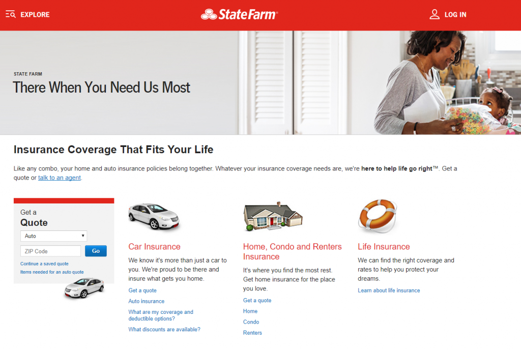
State Farm does this, using very little text and instead having clearly defined sections that lead visitors deeper into the information they are looking for.

Also, ensure that most important information is visible “above the fold” so the amount of scrolling needed is minimal.
6. Visuals
Use visual elements, such as images, videos, color, formatting, etc., to enhance the user experience. Make sure that the most important areas of the home page stand out visually. Use compelling images and video that support the goals of the page rather than being distracting.
7. Navigation
Although navigation is critical to the usability of all of your web pages, there is perhaps no other place where it is more sought out. Make sure your navigation is clear and highlights the main areas of your site. Even if your home page has a different layout from other web pages, the navigation’s location should be consistent, ideally at the top or on the left side of the page.
As a supplement to your useful navigation, make sure your internal site search box is prominent in case they can’t find what they need in the navigation.
Swing For the Fences
Your home page is the single most crucial page on your site. Even if visitors don’t initially land there, there’s a good chance they will visit your home page if they want to learn more about your company. Make sure your home page is in the position to score a home run every time by focusing on user experience.


2 Responses to 7 Ways to Make Your Home Page a Home Run for Usability