Last time I shared here, I established that a major problem affecting your site performance is that (because you designed or contributed to or commissioned and approved the site) YOU don’t have to think when YOU use the site because YOU know what everything means, how everything is supposed to work, where everything is located and where every click is supposed to go. Your visitors are left to interpret things that you already know the interpretation for.
A second major problem affecting your site performance is that you designed it for people who use the web in a similar fashion to how a straight-A student would study for a final exam; mulling over every last detail of information presented for fear that a question will be on the test regarding information skipped over. I don’t have exact numbers, but the amount of people that use the web in this way is—close to none.
 Instead, users typically scan pages looking only for the information that is relevant to the specific task at hand while blocking everything else out. During their scan, they many times don’t even pick the best option for their task (could it be your fault?), but pick the first option that seems like it’s what they’re looking for. After all, a benefit of the web is supposed to be the speed and ease with which you can get things done, right? If your choice to complete the task was wrong, you can simply hit the back button and start scanning for the next best option.
No, web users aren’t studying your pages for an exam. They’re scurrying to complete their task. Therefore, your job isn’t just to provide all the information they need to do so, but to provide it in a way that makes it quicker and easier for a scurry-er to process and move forward.
In his book Don’t Make Me Think, usability expert Steve Krug gives five important website usability actions you can perform to help make it a better environment for the scurry-ers that are using it…
1. Create a Clear Visual Hierarchy
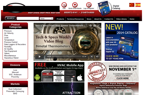
Instead of making your visitors figure out the importance and the relationships between things on your page/site, you need to use design principles to communicate these things. For example, more important things are bigger, bolder, in a more prominent spot on the page, etc. Things that are look related. Things that aren’t related have visual cues (like whitespace) that communicate they’re not related. This helps the scurry-er to be able to process all of the information on the page without having to “figure it out,” allowing the scurry-er to scurry (because that’s what they do!) instead of study the page. Take a look at the site below. By the looks of it, they are communicating that something NEW! is the most important thing on the page with their use of text size and color scheme. In second place is whatever is being promoted by the lightning (which is animated on the site btw). Just an FYI to the marketing department for this site: If the majority of your visitors aren’t coming to your site to get your new catalog, you might consider some changes to your visual hierarchy.

Usability Tip: Use design principles to communicate a clear visual hierarchy [tweet this]
2. Take Advantage of Website Usability Conventions
In all media, there are certain ways of doing things that become standard over time (they’re called conventions). Why? Because they work. Because they become standard, users come to expect that every outlet (website in our case) is going to use them. Since they expect it, they are likely to be frustrated if the convention is broken. The site logo is at the top-left of the page. The section navigation is at the left. The search box is at the top-right, and so on. The temptation for designers is to get cute and try something different in an effort to set themselves apart as all creative and artsy and innovative. Really, we love their spirit and encourage them to do so—except when it comes to conventions. Here, you get cute at your own risk. You’ve got to be absolutely positive you have a better solution before breaking a convention. The site above puts the search box to the left, undoubtedly causing some people to assume there isn’t a way to search on the site.
Usability Tip: Use website conventions (standard placements) to your advantage. [tweet this]
3. Break Pages Up into Clearly Defined Areas
Website usability is at its best when users aren’t asking questions about what things are and where they would go if they clicked something. When a site visually separates elements of a page in ways that make sense, users are able to scurry to the place that applies to them and get on with their task quickly, which is exactly what they want to do. This misalignment of the elements in the main part of the page above causes mental fatigue and confusion.
Usability Tip: Avoid mental fatigue & confusion by breaking pages into clearly defined areas. [tweet this]
4. Make What’s Clickable Obvious
Again, the goal of the scurry-er is to get to the next step quickly and efficiently. Therefore, links and buttons should look like—wait for it—links and buttons! For the web page above, notice the “digital catalog” graphic at the very top of the page. Am I supposed to click on that to get the catalog? If I can click on it, is that going to take me to another page, or will I instantly begin downloading the catalog? There are too many questions in my head.
Usability Tip: Links and buttons should look like links and buttons. Make what’s clickable obvious. [tweet this]
5. Minimize Noise
You know that feeling you get when the radio station isn’t quite coming in perfectly clear? Yeah, you might put up with it for a bit because you really like the song. But, eventually you can’t take it anymore and change the station. This can happen on your site if there’s simply too much going on. The temptation is to make the user aware of every possible thing available to them and how important each thing is at that. The problem is that once you cross a certain threshold, the user will just want to “change the station.” You’ve got to be careful with the amount and the intensity of what you display so that the user experience on the site is nice and clear. For the last time, look at the above site. Are we trying to help the user accomplish their task, or blast them with as many advertisements about our great stuff as we can fit in one space?! Also, how is the user supposed to discern the importance of things when everything is promoted as being important?!
Usability Tip: Be careful with the amount and intensity of what you display–minimize noise. [tweet this]
Bonus Tip: Notice how you have no idea what this site sells since I covered their brand name in the upper left corner with a black bar. (Actually, the brand name really wouldn’t clue you in either.) That’s all bad!
By applying these five simple website usability principles, I’m confident you’ll be surprised at how many things you’ve never noticed that are affecting your site performance. I’m also confident that you’ll start getting ideas for improvement instantaneously.

2 Responses to Website Usability Tips for How People Use the Web