
Digital marketers are all aware of what a landing page is and what goes into it. The subject has been covered enough times to make Google’s head spin. Landing pages are everywhere on today’s internet, but even the best ones aren’t perfect. Too often, the transition from lead to conversion is hindered by the lack of several critical elements.
Today, I’m going to show you the elements that drive the psychological and behavioral motivations behind a conversion. Now that you’ve created the perfect website, it’s time to take your landing pages to the next level by implementing these five critical elements:
1. Remove Extra Navigation Links
Everything you’ve done with your inbound marketing should point leads to your landing pages. Once you have them there, the last thing you want is for them to leave. Given this universal truth, why would any single landing page have navigational links?
Take a look at this landing page below:
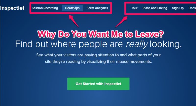
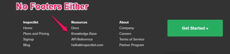
All of those links in the navigation bar are opportunities for your lead to click and leave before they engage with the call-to-action. The same goes for links in your footer:
According to studies done by MarketingSherpa, only 16% of landing pages used online are free of navigation bars! That leaves a whopping 84% of pages that are making this mistake and letting their leads walk out.
How do you fix this?
Depending on the landing page program you use, there should be options to hide your navigation bars and footers already built in. If not, you can use some CSS coding to remove these elements.
If you’re using an ID:
<style type=”text/css”>
#name-of-id{display: none;}
</style>
If you’re using a class:
<style type=”text/css”>
name-of-class{display: none;}
</style>
This is an option for advanced users. You should first look for an option to do this within your landing page software. When you’re finished, your landing page should look like this:
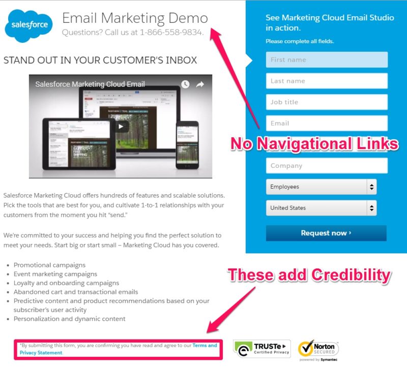
Notice that links to your privacy statement and terms of service are fine. These add credibility, and most users won’t feel the need to click on them. If they do, this is a great way to remove that obstacle in their minds.
2. Match Tone and Voice From the User’s Source
When people arrive on your landing pages, odds are they’ve come from one of several different sources. When they arrive, there should be no confusion as to where they are and what they came for. This is often referred to as “keeping the scent” from the source to the landing page.
By optimizing for the traffic source, you’re ensuring that the user doesn’t lose focus or change their mind. Design your landing pages based on where the user is coming from. Let’s take a look at an example from a PPC campaign:

As a business, I’m looking for a tool that I can use to find keywords that I can target to create relevant and useful content.
This ad promises all of those things for my business, so I click. This is the landing page that comes up:
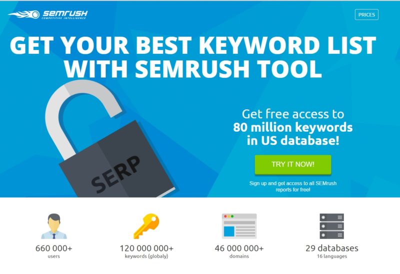
Ultimately, my goal is to better my SEO by using various types of keywords and long-tail variations. This landing page promises me access to the keywords I will need to make that happen. It’s a perfect match to the motivation that brought me here, and it matches the ad’s message.
Keep this in mind as your users come from social media ads, PPC campaigns, or from other posts on your website.
Continue the conversation you started in the ad on your landing page.
3. Make Users Want to Share Your Landing Pages
Here’s a question for you:
When have you ever wanted to share a landing page?
You’re probably having trouble thinking of a single example. Don’t worry. Landing pages are rarely shareable. Some would even argue that placing social media buttons on the page distracts the lead in the same way navigational links would.
I agree, which is why you should wait until after the lead engages with your call-to-action before you ask them to share the landing page on social media. Even this isn’t enough, however. We need to get them so excited about converting that they absolutely need to share.
Here are some ways to make that happen:
- Make Your Customer Proud – Research shows that people are 25% more likely to purchase something they would be proud to own. On top of this, people are also 25% more likely to convert if they see sharing buttons near the product. Ask yourself why your customers should be proud they purchased your product and answer that question on your landing pages.
- Tell a Story – Your landing page should tell a story that not only showcases how your product enriches customer’s lives, but it should also be so compelling that the user will want to share it with others. Give it a human touch and a genuine tone.
- Give Something Away – People love free things. No study is needed to prove that. By offering a great and valuable gift for converting, you give people an excellent reason to spread the word.
Once they’ve converted, thank your user and remind them why you think they would want to share this landing page on social media. Provide some buttons in your “thank you” message, and watch the news spread.
4. Balance Pain and Pleasure
Persuasion is all about pleasure and pain. As humans, we do everything we can to avoid pain and seek pleasure. The ideal landing page balances these two principles through the tone, voice, and imagery used in the layout.
The pain aspect is conveyed by reminding the user what problem it is that you’re trying to solve. It immediately makes them recall that pain. Check out this landing page:
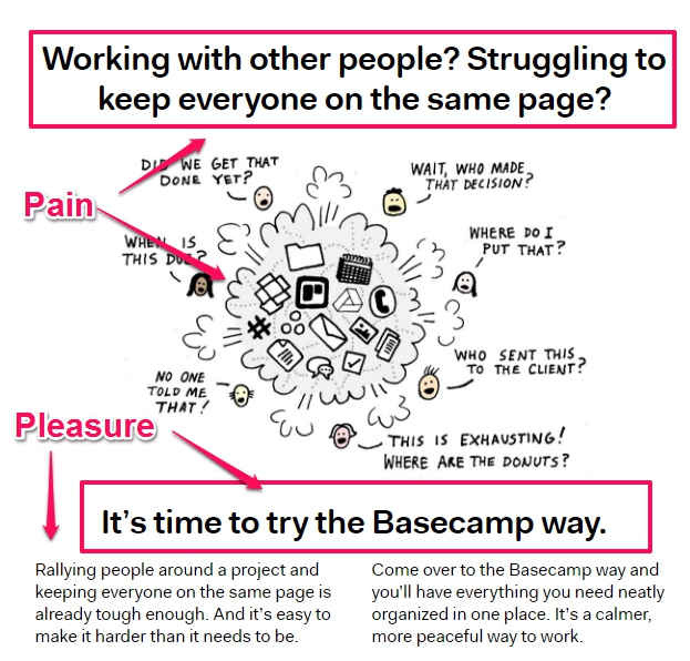
This is for the popular collaboration tool, Basecamp. As you can see, it opens with a question that calls to mind the struggle of keeping a team organized and focused. That’s the pain. The pleasure kicks in when they promise a new and better way to handle this situation.
Try this in your own landing pages by asking your users a question that calls to mind a problem they’ve had. Once you’ve done that, show them how your product solves that problem through examples, features, and benefits. Remember to also use emotional words and utilize pictures that convey those same emotions.
By balancing these two emotions, you can drive them towards your goal.
5. Utilize Social Proof
Social proof is what happens when someone sees that their peers are doing something and they feel influenced to do it as well. It’s the same feeling you get when you pass a restaurant that has a packed parking lot. If all those people are eating there, maybe you should as well.
One of the best ways to use social proof in your landing pages is through testimonials like this one:
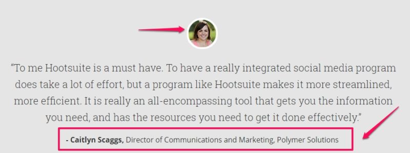
This is a ringing endorsement for Hootsuite. After reading this, a user will feel more compelled to try the product as well. Notice that there are three crucial elements at play here:
- Convincing copy
- A name and business position/company
- A picture
Your testimonials should also include all three of these things for maximum impact.
Get Started
When it comes to landing pages, the devil is truly in the details. Take a look at your own efforts and see if any of these crucial elements are missing. Make changes, and then let us know how your conversions changed and what tips you would offer in the comments below!